HTML5/CSS3笔记
0. 补充
0.1 图片空隙产生原因及解决办法
顶线:中文汉字的的上端沿;
中线:横过英文字母x的中间的线;
基线(base line)并不是汉字文字的下端沿,而是英文字母“x”的下端沿;
底线:中文汉字的下端沿;
内容区:指底线和顶线包裹的区域(行内元素 display:inline 可以通过 background-color 属性显示出来),实际中不一定看得到,但确实存在。内容区的大小依据 font-size 的值和字数进行变化。
行高(line-height):包括内容区与以内容区为基础对称拓展的空白区域,我们称之为行高。一般情况下,也可以认为是相邻文本行基线间的距离。
行间距:指相邻文本行间上一个文本行底线和下一文本行顶线之间的距离。计算方式:(行高 - 字体大小)/ 2
行内框:是一个浏览器渲染模型中的一个概念,无法显示出来,但是它又确实存在,它的高度就是行高指定的高度。
行框(line box):同行内框类似的概念,行框是指本行的一个虚拟的矩形框,也是浏览器渲染模式中的一个概念。行框高度等于本行内所有元素中行内框最大的值(以行高值最大的行内框为基准,其他行内框采用自己的对齐方式向基准对齐,最终计算行框的高度
- 行内元素的背景色的范围是字体大小决定的,但是背景色不包括行高的范围,所以行高区域内并不是由字体大小决定的。只有 line-height 会把父元素撑起来
- 当行高大于字体高度时,就会上下撑开,达到垂直居中的目的
- 对行内元素可以设置 vertical-align,这样可以设置文字的对齐方式。默认为 baseline,示例:
<!DOCTYPE html>
<html lang="en">

<head>
    <meta charset="UTF-8">
    <meta http-equiv="X-UA-Compatible" content="IE=edge">
    <meta name="viewport" content="width=device-width, initial-scale=1.0">
    <title>Document</title>
    <style>
        .cc1 {
            font-size: 20px;
            background-color: red;
            vertical-align: top;
            line-height: 30px;
        }
        .cc2 {
            font-size: 30px;
            background-color: red;
            vertical-align: top;
            line-height: 40px;
        }
        .cc3 {
            font-size: 40px;
            background-color: red;
            vertical-align: top;
        }
    </style>
</head>

<body>
    <div>
        <span class="cc1">第一段</span>
        <span class="cc2">第二段</span>
        <span class="cc3">第三段</span>
    </div>
</body>

</html>
2
3
4
5
6
7
8
9
10
11
12
13
14
15
16
17
18
19
20
21
22
23
24
25
26
27
28
29
30
31
32
33
34
35
36
37
38
- div 中如果有图片,会有 3px 的空隙,原因:img 是一个行内元素,遵守行高的构成,基于基线对齐而不是底线,故会有一个基线与底线的空隙。
- 解决方法一:可以通过设置图片的
vertical-align: bottom设置为底线对齐。 - 解决方法二:
display: block
- 解决方法一:可以通过设置图片的
0.2 响应式布局举例
<!DOCTYPE html>
<html lang="en">

<head>
  <meta charset="UTF-8">
  <meta http-equiv="X-UA-Compatible" content="IE=edge">
  <meta name="viewport" content="width=device-width, initial-scale=1.0">
  <title>Document</title>
  <style>
    * {
      margin: 0;
      padding: 0;
    }

    ul {
      list-style: none;
    }

    a {
      text-decoration: none;
    }

    .main-nav {
      max-width: 1200px;
      margin: 0 auto;
    }

    .main-nav logo {
      display: block;
      float: left;
    }

    .main-nav .menu {
      display: none;
      float: right;
    }

    .nav {
      float: right;
    }

    .nav li {
      display: inline-block;
    }

    .body {
      max-width: 1200px;
      margin: 0 auto;
    }

    .body ul li {
      float: left;
      width: 25%;
      transition: 0.5s linear;
    }

    .body ul li img {
      width: 100%;
    }

    @media screen and (max-width:768px) {
      .body ul li {
        width: 50%;
      }
    }

    @media screen and (max-width:576px) {
      .main-nav .menu {
        display: block;
      }

      .nav {
        display: none;
      }

      .body ul li {
        width: 100%;
      }
    }
  </style>
</head>

<body>
  <nav class="main-nav">
    <a href="javascript:;" class="logo">LOGO</a>
    <ul class="nav">
      <li><a href="javascript:;">电视剧</a></li>
      <li><a href="javascript:;">动漫</a></li>
      <li><a href="javascript:;">电影</a></li>
    </ul>
    <a href="javascript:;" class="menu">菜单</a>
    <div style="clear: both;"></div>
  </nav>
  <div class="body">
    <ul>
      <li><img src="./images/雪地靴.jpg" alt=""></li>
      <li><img src="./images/皮衣.jpg" alt=""></li>
      <li><img src="./images/男靴.jpg" alt=""></li>
      <li><img src="./images/棉服.jpg" alt=""></li>
      <div style="clear: both;"></div>
    </ul>
  </div>
</body>

</html>
2
3
4
5
6
7
8
9
10
11
12
13
14
15
16
17
18
19
20
21
22
23
24
25
26
27
28
29
30
31
32
33
34
35
36
37
38
39
40
41
42
43
44
45
46
47
48
49
50
51
52
53
54
55
56
57
58
59
60
61
62
63
64
65
66
67
68
69
70
71
72
73
74
75
76
77
78
79
80
81
82
83
84
85
86
87
88
89
90
91
92
93
94
95
96
97
98
99
100
101
102
103
104
105
1. HTML5
1.1 实体
有些时候我们不能直接书写一些特殊符号:多个连续空格、字符两侧的>、<符号等
具体去w3school查询:https://www.w3school.com.cn/html/html_entities.asp
实体(转义字符)语法
格式:&实体名字;:
:表示一个空格>:表示一个大于号<:表示一个小于号©:版权符号
实例代码
<body>
<!--
网页中的多个空格默认情况会自动被浏览器解析为一个空格
有些时候我们不能直接书写一些特殊符号:
-->
<p>今天 天气 真 不错</p>
<p>
a<b>p
</p>
<p>今天 天气真不错</p>
<p>
a<b>p
©
</p>
</body>
2
3
4
5
6
7
8
9
10
11
12
13
14
15
16
1.2 meta标签
<head>
    <meta charset="UTF-8">
    <meta http-equiv="refresh" content="3;url=https://www.baidu.com">
    <meta name="viewport" content="width=device-width, initial-scale=1.0">
    <meta name="keywords" content="购物,前端,css">
    <meta name="description" content="一个非常不错的网站">
    <!--
        meta主要用于设置网页中的一些元数据,元数据不是给用户看
        charset 指定网页的字符集
        name 指定的数据的名称,里面内容表示网站的关键字
        content 指定的数据的内容

        <meta http-equiv="refresh" content="3;url=https://www.baidu.com">
        上面代码表示 3 秒后跳转到 baidu.com
     -->
    <title>实体</title>
</head>
2
3
4
5
6
7
8
9
10
11
12
13
14
15
16
17
1.3 语义化标签
h1-h6 标签:表示标题。是块元素(block element),独占一行
p 标签:表示页面的一个段落。是块元素
hgroup 标签:为标题分组,可以将一组相关的标签同时放入到 hgroup
<body>
    <hgroup>
        <h1>nihao</h1>
        <h2>woshi yxy</h2>
    </hgroup>
</body>
1
2
3
4
5
6em 标签:表示语气、声调加重突出(重点),使选定内容斜体加粗。例如
<p>今天天气<em>真</em>不错</p>。是行内元素(inline element)strong 标签:表示强调重要的内容,使选定内容加粗。例如
<p>你今天必须要<strong>完成</strong>作业!</p>。是行内元素blockquote 标签/q标签:表示长引用/短引用。例如
<body>
    鲁迅说:
    <blockquote>
        这句话我没说过
    </blockquote>
    子曰:<q>学而时习之,乐呵乐呵</q>
</body>
1
2
3
4
5
6
7header:表示网页的头部
main:表示网页的主体部分(一个页面中只会有一个main)
footer:表示网页的底部
nav:表示网页的导航
aside:和主体相关的其他内容(侧边栏)
article:表示一个独立的文章
section:表示一个独立的区块,上边的标签都不能表示时可以用section
div:上面都不常用,用这个!
span:上面都不常用,用这个!
1.4 列表
有序列表
<ol>
    <li>结构</li>
    <li>表现</li>
    <li>行为</li>
</ol>
1
2
3
4
5无序列表
<ul>
    <li>结构</li>
    <li>表现</li>
    <li>行为</li>
</ul>
1
2
3
4
5定义列表
使用dl标签创建一个定义列表,使用dt来表示定义的内容,使用dd来对内容进行解释说明
举例:
<dl>结构</dl>
<dd>结构表示网页的结构,结构用来规定网页中哪里是标题,哪里是段落</dd>
1
2
1.5 超链接
href 属性:这个不必多说
target 属性:可选值:
- _self:默认值,在当前页面打开超链接
- _blank:在一个新的页面中打开超链接
跳转顶部与跳转底部:
- 跳转顶部:
<a href="#">回到顶部</a> - 跳转底部:
<a href="#bottom">去底部</a>
<a href="#" id="bottom">我是底部</a>
1
2
3- 跳转顶部:
无跳转占位符:
<a href="javascript:;">无跳转占位符</a>奇淫巧计:vscode中,输入
lorem,然后按tab输出一大堆英文
1.6 图片
- src 属性:不必多言
- alt 属性:图片的描述,默认不显示,有些浏览器在图片无法加载时显示。搜索引擎根据 alt 内容来识别图片
- width 属性:图片宽度(单位是像素)
- height 属性:图片高度
- 宽度和高度若只修改了一个,则另一个会等比例缩放
- 图片常用格式
- jpeg
- 支持的颜色比较丰富,不支持透明效果,不支持动图
- 一般用来显示照片
- gif
- 支持的颜色比较少,支持简单透明,支持动图
- 颜色单一的图片、动图
- png
- 支持的颜色丰富,支持复杂透明,不支持动图
- 颜色丰富、复杂透明的图片(为网页而生)
- webp
- 谷歌新推出的专门用来表示网页中的图片的一种格式
- 它具备其他图片格式的所有优点,而且文件还特别小
- 缺点:兼容性不好,垃圾ie浏览器不能用
- base64
- 将图片使用base64进行编码,可以直接将图片转换成字符,通过字符的形式来引用图片
- 一般都是一些需要和网页一起加载的图片才会使用base64(加载图片速度最快)
- jpeg
1.7 内联框架(将近淘汰)
- 内联框架,用于向当前页面中引入一个其他页面
- 格式:
<body>
    <!--
        src 指定要引入的网页的路径
        frameborder 指定内敛框架的边框
     -->
    <iframe src="https://yuanke3.github.io/docs/" frameborder="0"></iframe>
</body>
2
3
4
5
6
7
1.8 音视频
音频
- audio 标签和 video 标签默认不允许用户自己控制播放停止
- 若要控制播放,要如此写(加个 controls):
<audio src="./source/1.mp3" controls></audio>1
audio 的一些属性:
- autoplay 属性:是自动播放(大部分浏览器都不会自动对音乐进行播放)
- loop 属性:重复播放
- src 属性:无需多言
- controls + source 属性:可以播放音频,同时用来提醒 ie 用户升级浏览器(只有 ie 浏览器用户会显示这段文字)。可以用 source 指定文件,例如:
<audio controls>
    对不起,您的破烂 ie 浏览器不支持播放音频!快去升级!
    <source src="./source/1.mp3">
</audio>
1
2
3
4- embed 标签:ie 浏览器用 embed 标签,用 src 属性来得到音频路径,同时要同时指定 width 和 height 属性,不然不显示播放器;同时还要指定 type 属性值,例如 "audio/mp3"
- 最好的兼容方式:
<audio controls>
    <source src="./source/1.mp3">
    <embed src="./source/1.mp3" width="200px" height="300px" type="audio/mp3" />
</audio>
1
2
3
4
- 视频
<video controls">
    <source src="./source/flowers.webm">
    <source src="./source/flowers.mp4">
    <embed src="./source/flowers.mp4" type="video/mp4">
</video>
2
3
4
5
## 2. CSS入门
2.1 CSS编写位置
内联样式(行内样式)
- 标签内部通过 style 属性设置元素的样式
- 例子:
<p style="color: red; font-size: 60px">我是测试</p>1内部样式表
- 编写在 head 中的 style 标签里
- 例如:
<style>
    p{
        color: green;
        font-size: 50px;
    }
</style>
1
2
3
4
5
6外部样式表
- 编写在外部 css 中,使用 link 引入
- 例如:
<link rel="stylesheet" href="">1
2.2 常用选择器
元素选择器:id选择器、类选择器、通配选择器(如 * 等)、标签名选择器、并集选择器、交集选择器
2.3 复合选择器
交集选择器:
作用:选中同时符合多个条件的元素
语法:选择器1选择器2选择器3
注意点:交集选择器中如果有元素选择器,必须使用元素选择器开头
代码举例:
<style>
    div.red {
        font-size: 30px;
    }
</style>

<body>
    <div class="red">测试1</div>
    <p class="red">测试2</p>
</body>
2
3
4
5
6
7
8
9
10
并集选择器
- 作用:同时选择多个选择器对应的元素
- 语法:选择器1, 选择器2, 选择器3
- 例子:无需
关系选择器
- 子元素选择器:
- 语法:父元素 > 子元素
- 后代元素选择器
- 语法:祖先 后代
- 相邻兄弟选择器:
- 语法:前一个 + 下一个
- 选择下边所有兄弟:语法:兄 ~ 弟
- 子元素选择器:
属性选择器
- 语法:
- [属性名]:选择含有指定属性的元素
- [属性名=属性值]:选择含有指定属性和属性值的元素
- [属性名^=属性值]:选择属性值以指定值开头的元素
- [属性名$=属性值]:选择属性值以指定值结尾的元素
- [属性名*=属性值]:选择属性值中含有某值的元素
- 语法:
<style>
    p[title]{
        color: orange;
    }
	p[title=abc]{
    	color: red;
	}
	p[title^=yuan]{
    	color: black;
	}
	p[title$=pp]{
    	color: gold;
	}
	p[title*=aaa]{
    	color: blue;
	}
</style>

<body>
    <p title="hello">hahaha</p>
    <p>mimimi</p>
    <p title="abc">we are good</p>
    <p title="yuanxinyue">66666</p>
    <p title="pppp">noscript</p>
    <p title="nbaaaa">so we</p>
</body>
2
3
4
5
6
7
8
9
10
11
12
13
14
15
16
17
18
19
20
21
22
23
24
25
26
拓展:vscode的快捷键
- ul>li
- ul>li*5:生成五个li后,进入第一个li里面输入完内容后按tab,可以直接跳转到第二个li里面
2.4 伪类选择器
一个 : 是伪类选择器,两个 : 是伪元素选择器
伪类定义:用来描述一个元素的特殊状态,比如:第一个子元素、被点击的元素、鼠标移入的元素
伪类一般情况下都是以:开头
伪类举例一:
:first-child:表示第一个子元素,例如
ul > li:first-child{}:last-child:表示最后一个子元素
:nth-child():表示第n个子元素
- 参数填的数字就是表示第几个元素,例如
ul > li:nth-child(2){} - 参数填 n 表示全部选中,2n 表示选中偶数位的元素,2n+1 表示选中奇数位的元素
- 参数填 odd 表示选中奇数位的元素,even 表示偶数位的元素
- 参数填的数字就是表示第几个元素,例如
以上这些伪类都是根据所有的子元素进行排序
:first-of-type:与上面类似,但是他们是在同类型元素中进行排序
:last-of-type 同上
:nth-of-type 同上
<style>
    /* 不生效 */
    ul > li:first-child{
        color: red;
    }
	/* 生效 */
	ul > li:first-of-type{
    	color: red;
	}
</style>

<body>
    <ul>
        <span>我才是第一个!!!</span>
        <li>第一个</li>
        <li>第二个</li>
        <li>第三个</li>
        <li>第四个</li>
        <li>第五个</li>
    </ul>
</body>
2
3
4
5
6
7
8
9
10
11
12
13
14
15
16
17
18
19
20
21
伪类举例二
- :not():否定伪类,表示除了,将符合条件的元素从选择器中去除
/* 将除了第三个li的所有颜色设置为yellowgreen */
ul > li:not(:nth-of-type(3)){
    color: yellowgreen;
}
1
2
3
4超链接的伪类
- a:link{}:选中没访问的链接(正常的链接)
- a:visited{}:选中访问过的链接。由于隐私的原因,所以 visited 这个伪类只能修改链接的颜色
- a:hover{}:用来表示鼠标移动的状态
- a:active{}:用来表示鼠标点击的状态
2.5 伪元素选择器
伪元素表示页面中一些特殊的并不真实的存在的元素(特殊的位置)。伪元素以::开头
- ::first-letter:表示第一个字母。下面例子相当于将首字母 L 添加一个不存在的 span 标签
<style>
    p::first-letter{
        font-size: 50px;
    }
</style>
<body>
    <p>Lorem ipsum dolor sit, amet consectetur adipisicing elit. Qui expedita praesentium quas excepturi, 		omnis tenetur aspernatur asperiores laborum dolorem accusamus! Provident, id soluta nisi ipsa dolores 		sequi officiis accusantium porro?</p>
</body>
2
3
4
5
6
7
8
::first-line:表示第一行
::selection:表示选中的内容
::before / ::after:表示元素的开始 / 结束。必须结合 content 属性来使用。
- 因为是利用 CSS 添加的,所以不能选中。非常适合括号内写文字时,消除要复制括号的影响
- 实例代码:结果是 hello 前面添加了一个 abc,you 后面添加了一个 666
div::before{
    content: 'abc';
    color: red;
}
div::after{
    content: '666';
    color: gold;
}

<body>
    <div>hello hello how are you</div>
</body>
1
2
3
4
5
6
7
8
9
10
11
12
2.6 继承
祖先元素的样式会应用到它的后代元素上
- 注意:并不是所有的样式不会被继承,例如背景相关的、布局相关的不会被继承。例如如果 p 标签包着 span,p 设置背景颜色,那么 span 不会继承
2.7 选择器的权重
当通过不同的选择器,选中相同的元素,并为相同的样式设置不同的值时,此时会发生样式的冲突
- 引例:结果是红色
<style>
    div{
        color: yellow;
    }
	.red{
    	color: red;
	}
</style>

<body>
    <div id="box1" class="red">我是一个div</div>
</body>
2
3
4
5
6
7
8
9
10
11
12
- 选择的权重(从高到底排列)
- 内联样式 1000
- id选择器 100
- 类和伪类选择器 10
- 元素选择器 1
- 通配选择器 0
- 继承的样式 无优先级
- 比较优先级时,需要将所有的选择器的优先级进行相加计算,则优先显示,所以,#box1和div#box1会优先使用后者的样式
- 分组选择器(div,p,span{})是单独计算的
- 选择器的累加不会超过最大的数量级,类选择器最高也不会超过id选择器
- 如果优先级计算后相等,则优先使用靠下的样式
- !important:可以在某一个样式的后面添加 !important,则此时改样式会获取到最高的优先级,甚至超过内联样式。在开发中,这个要慎用!
2.8 像素和百分比
长度单位
像素:px
百分比:
- 可以设置属性相对于父元素的百分比
- 设置百分比可以使子元素跟随父元素的改变而改变
em:
- em是相当于字体大小计算的
- 1em = 1font-size
- em会根据字体大小改变而改变
.box1{
    font-size: 30px;
    height: 10em; /* 10*30=300px */
    width: 10em; /* 10*30=300px */
    background-color: red;

}
1
2
3
4
5
6
7rem:
- rem是相对于根元素的自大小来计算
- 只需要
html{font-size: 30px;}这样设置网页字体大小,那么 1rem = 30px
2.9 RGB值
- red、green、blue
- 每一种颜色范围在0-255之间
- 格式举例:
background-color: rgb(0, 255, 0) /* 绿色 */ - rgb(0, 0, 0):黑色,rgb(255, 255, 255):白色
- rgba:多的那个a是透明度。0表示完全透明(看不到了),.5表示半透明,1表示完全不透明
- 十六进制的RGB值:
- 语法:#红色绿色蓝色
- 颜色浓度通过 00-ff 表示
- 成双的可以简写,例如护眼色
#bfa ==> #bbffaa
2.10 HSL值
- H:色相(0-360)、S:饱和度(0-100%)、L:亮度(0-100%)
- 很少用,工业用的
3. 盒子模型
3.1 文档流
网页是一个多层的结构。这些层中,最底下一层是文档流,文档流是网页的基础。我们所创建的元素默认都在文档流中进行排列
- 元素的两个状态:在文档流中、不在文档流中
- 元素在文档流中的特点:
- 块元素:
- 块元素会在页面中独占一行
- 默认宽度是父元素的全部(会把父元素撑满)
- 默认高度是被内容撑开(子元素)
- 行内元素
- 行内元素不会独占一行,只占自身大小
- 行内元素在页面中自左向右水平排列。如果一行之中不能容纳下行内元素,则元素会换在第二行继续自左向右排列(即书写习惯)
- 行内元素的默认宽度和高度都是被内容撑开
- 块元素:
3.2 盒子组成部分
CSS将页面中的所有元素都设置为了一个矩形的盒子
内容区(content):大小由 height 和 width 两个属性来设置,width 默认值是auto(本节后面有讲)
边框(border):要设置边框,至少设置三个样式:
边框的宽度:border-width
- 默认值:3px(3个像素)
- 四个参数:上 右 下 左
- 三个参数:上 左右 下
- 两个参数:上下 左右
- 一个参数:上下左右
- 除了 border-width 还有一组 border-xxx-width,xxx可以是 top right bottom left,用来单独制定某一个边的宽度(后面的 border-color 和 border-style 都有这种属性!)
边框的颜色:border-color
- 规则同上
边框的样式:border-style
- solid:实线
- dotted:点状虚线
- dashed:线状虚线
- double:双线
- none:设置后边框消失
边框的大小会影响整个盒子的大小!
边框简写形式:border: 1px orange solid 这样
- 四个其他关于border的样式:(选中边框的一边)
- border-top
- border-right
- border-bottom
- border-left
内边距(padding)
- 四个属性:padding-top、padding-right、padding-bottom、padding-left
内边距的设置会影响到盒子的大小!
padding简写形式:上 右 下 左
总结1、2、3点:计算盒子可见框的大小时,由内容区+内边距+边框共同决定!
外边距(margin)
外边距不会影响盒子的大小
外边距会影响盒子的位置
margin-top、margin-right(默认情况下不起作用)、margin-bottom、margin-left
元素在页面中按照自左向右的顺序排序,所以默认情况上若设置 左上 边距会移动元素本身,而设置 下右 外边距会移动其他元素
3.3 盒子的水平布局
元素的水平方向布局:元素在其父元素中水平方向的位置由以下几个属性共同决定:margin-left、border-left、padding-left、width、padding-right、border-right、margin-right。这几个属性的总和等于父元素内容区的宽度!!!
根据上面定理,实例如下:
<style>
    .outer{
        width: 800px;
        height: 200px;
        border: 10px red solid;
    }
    .inner{
        width: 200px;
        height: 200px;
        background-color: #bfa;
        margin-left: 100px;
        margin-right: 300px; /* 无用设置,因为是过度约束,会被自动变成500以满足等式 */
    }
</style>

<div class="outer">
    <div class="inner"></div>
</div>
1
2
3
4
5
6
7
8
9
10
11
12
13
14
15
16
17
18可见,0 + 0 + 0 + 200 + 0 + 0 + 0 并不等于800!则称为 过度约束 ,则等式会自动调整。如果这七个值没有 auto 的情况,则浏览器 会自动调整 margin-right 的值 使等式成立!
如果某个值设置为 auto ,则会自动调整为 auto 的那个值使等式成立(margin-right 就不会被默认改变了)!
根据 3 ,则可知设置 margin-right 的方法:
<style>
    .outer{
        width: 800px;
        height: 200px;
        border: 10px red solid;
    }
    .inner{
        width: auto; /* 自动调整 width,则 width = 500,margin-right = 300 */
        height: 200px;
        background-color: #bfa;
        margin-right: 300px;
    }
</style>

<div class="outer">
    <div class="inner"></div>
</div>
1
2
3
4
5
6
7
8
9
10
11
12
13
14
15
16
17如果将一个宽度和一个外边距设置为 auto,则宽度会调整到最大,设置为 auto 的外边距会自动为 0。如果将三个值设置为 auto,则外边距都是 0,宽度最大
如果两个外边距设置为 auto、宽度固定值,则会将外边距设置为相同的值。利用这一特点,使一个元素在其父元素中水平居中。示例:
width: xxxpx;
margin: 0 auto; /* 上下 左右 */
1
2当某元素有定位时,产生过度约束时,会 自动调整 left 的值为 auto!
3.4 盒子垂直方向布局
- 默认情况下,父元素的高度被内容撑开
- 子元素实在父元素的内容区中排列的,如果子元素的大小超过了父元素,则子元素会从父元素中溢出。使用 overflow 属性来设置父元素如何处理溢出的子元素
- overflow 属性的属性值:
- visible:默认值,子元素会从父元素中溢出,在父元素外部的位置显示
- hidden:溢出的内容将会被裁剪不会显示
- scroll:生成两个滚动条,通过滚动条来查看完整的内容
- auto:根据需要生成滚动条
- overflow-x / overflow-y:水平 / 垂直方向滚动条
3.5 垂直外边距的折叠
- 相邻的垂直方向外边距会发生重叠现象。(俩元素一上一下,上面元素 margin-bottom 设置100px,下面元素 margin-top 设置100px,但是实际上俩元素相隔还是 100px)
- 兄弟元素间的相邻垂直外边距会取两者之间的较大值。(上面案例中若下面元素是 150px,那么俩元素相隔 150px)
- 特殊情况:
- 如果相邻的外边距一正一负,则取两者的和
- 如果相邻的外边距都是负,则取两者绝对值较大者
- 第1、2、3点的实例:
<style>
    /* box1、box2 垂直方向相隔仍是 100px */
    .box1,.box2{
        width: 200px;
        height: 200px;
    }
	.box1{
    	background-color: #bfa;
    	margin-bottom: 100px;
	}
	.box2{
  		background-color: orange;
    	margin-top: 100px;
	}
</style>

<body>
    <div class="box1"></div>
    <div class="box2"></div>
</body>
2
3
4
5
6
7
8
9
10
11
12
13
14
15
16
17
18
19
20
- 父子元素间的相邻外边距,子元素的会传递给父元素(上外边距)。父子外边距的折叠会影响页面的布局。下面的举例:想把 box4 从 box3 的左上角向下移动 100px,但结果却是 box3、box4 一起向下移动了 100px
<style>
    .box3{
        width: 200px;
        height: 200px;
        background-color: #bfa;
    }
	.box4{
    	width: 100px;
    	height: 100px;
    	background-color: orange;
    	margin-top: 100px;
	}
</style>

<body>
    <div class="box3">
        <div class="box4"></div>
    </div>
</body>
2
3
4
5
6
7
8
9
10
11
12
13
14
15
16
17
18
19
第5点的解决办法(目前进度的,以后用 position):
- 方法一:不设置子元素的 margin-top,去设置父元素的 padding-top:
.box3{
    padding-top: 100px;
    height: 100px; /* 原先是200px,但是被padding-top挤开后,下面的100px是多余的,故设置为100px */
}
1
2
3
4- 方法二:由于父子元素的外边距重叠了,所以可以给父元素设置一个 border-top,隔开父子元素:
<style>
    .box3{
        width: 200px;
        height: 199px;
        background-color: #bfa;
        border-top: 1px #bfa solid;
    }
    .box4{
        width: 100px;
        height: 100px;
        background-color: orange;
        margin-top: 99px;
    }
</style>
1
2
3
4
5
6
7
8
9
10
11
12
13
14
3.6 行内元素的盒模型
- 行内元素不支持设置 width 和 height
- 行内元素可以设置 padding、border、margin,但是垂直方向的 padding、border、margin不会影响页面的布局(不会挤开其他元素,只会覆盖)
- display 用来设置元素显示的类型:
- inline:将元素设置为行内元素
- block:将元素设置为块元素
- inline-block:行内块。将元素设置为行内块元素,既可以设置宽度和高度,又不会独占一行
- table:把元素设置为一个表格
- none:元素不在页面中显示
- visibility 用来设置元素的显示状态:
- visible:默认值,元素在页面中正常显示
- hidden:元素在页面中隐藏 不显示,但是依然占据页面的位置
3.7 默认样式
通常情况,浏览器都会为元素设置一些默认样式
- 引例:
<style>
    .box1{
        width: 100px;
        height: 100px;
        border: 1px solid black;
    }
    body{
        margin: 0px;
    }
    p{
        margin: 0px;
    }
    ul{
        margin: 0px;
        padding: 0px;
        list-style: none; /* 去除项目符号 */
    }
</style>
2
3
4
5
6
7
8
9
10
11
12
13
14
15
16
17
18
- 最简单的去除默认样式的方法:
*{
    margin: 0;
    padding: 0;
}
2
3
4
- 拿来主义——别人写好的样式重置表:
- 网站:重置样式表open in new window
- reset.css:直接去除了浏览器的默认样式
- normalize.css:对默认样式进行了统一
3.8 京东导航条练习
- 京东左侧导航
<!-- 京东左侧导航 -->
<!DOCTYPE html>
<html lang="en">

<head>
  <meta charset="UTF-8">
  <meta http-equiv="X-UA-Compatible" content="IE=edge">
  <meta name="viewport" content="width=device-width, initial-scale=1.0">
  <link rel="stylesheet" href="./css/reset.css">
  <title>京东的左侧导航</title>
  <style>
    body {
      /* 设置一个网页的背景,以便查看 */
      background-color: #bfa;
    }

    /* 设置菜单外部元素,直接去京东f12看盒子 */
    .left-nav {
      width: 190px;
      height: 450px;
      padding-bottom: 10px 0px;
      background-color: #fff;
      margin: 50px auto;
    }

    /* 设置菜单内部的item */
    .left-nav .item {
      height: 25px;
      /* 让文字垂直居中,只需要高度和行高保持一致即可 */
      line-height: 25px;
      /* 为了使超链接还在hover里,应该设置padding-left */
      padding-left: 18px;
      /* 设置斜杆大小,后面的font-size会覆盖这里的 */
      font-size: 12px;
    }

    .left-nav .item:hover {
      background-color: #d9d9d9;
    }

    .item a {
      /* 设置字体大小 */
      font-size: 14px;
      /* 设置字体的颜色 */
      color: #333;
      /* 去除下划线 */
      text-decoration: none;
    }

    .item a:hover {
      color: #c81623;
    }
  </style>
</head>

<body>
  <nav class="left-nav">
    <div class="item">
      <a href="#">家用电器</a>
    </div>
    <div class="item">
      <a href="#">手机</a> / <a href="#">运营商</a> / <a href="#">数码</a>
    </div>
    <div class="item">
      <a href="#">电脑</a> / <a href="#">办公</a>
    </div>
    <div class="item">
      <a href="#">家居</a> / <a href="#">家具</a> / <a href="#">家装</a> / <a href="#">厨具</a>
    </div>
    <div class="item">
      <a href="#">男装</a> / <a href="#">女装</a> / <a href="#">童装</a> / <a href="#">内衣</a>
    </div>
    <div class="item">
      <a href="#">美妆</a> / <a href="#">个护清洁</a> / <a href="#">宠物</a>
    </div>
    <div class="item">
      <a href="#">女鞋</a> / <a href="#">箱包</a> / <a href="#">钟表</a> / <a href="#">珠宝</a>
    </div>
    <div class="item">
      <a href="#">男鞋</a> / <a href="#">运动</a> / <a href="#">户外</a>
    </div>
    <div class="item">
      <a href="#">房产</a> / <a href="#">汽车</a> / <a href="#">汽车用品</a>
    </div>
    <div class="item">
      <a href="#">母婴</a> / <a href="#">玩具乐器</a>
    </div>
    <div class="item">
      <a href="#">食品</a> / <a href="#">酒类</a> / <a href="#">生鲜</a> / <a href="#">特产</a>
    </div>
    <div class="item">
      <a href="#">艺术</a> / <a href="#">礼品鲜花</a> / <a href="#">农资绿植</a>
    </div>
    <div class="item">
      <a href="#">医药保健</a> / <a href="#">计生情趣</a>
    </div>
    <div class="item">
      <a href="#">图书</a> / <a href="#">文娱</a> / <a href="#">电子书</a>
    </div>
    <div class="item">
      <a href="#">机票</a> / <a href="#">酒店</a> / <a href="#">旅游</a> / <a href="#">生活</a>
    </div>
    <div class="item">
      <a href="#">理财</a> / <a href="#">众筹</a> / <a href="#">白条</a> / <a href="#">保险</a>
    </div>
    <div class="item">
      <a href="#">安装</a> / <a href="#">维修</a> / <a href="#">清洗</a> / <a href="#">二手</a>
    </div>
    <div class="item">
      <a href="#">工业品</a>
    </div>
  </nav>
</body>

</html>
2
3
4
5
6
7
8
9
10
11
12
13
14
15
16
17
18
19
20
21
22
23
24
25
26
27
28
29
30
31
32
33
34
35
36
37
38
39
40
41
42
43
44
45
46
47
48
49
50
51
52
53
54
55
56
57
58
59
60
61
62
63
64
65
66
67
68
69
70
71
72
73
74
75
76
77
78
79
80
81
82
83
84
85
86
87
88
89
90
91
92
93
94
95
96
97
98
99
100
101
102
103
104
105
106
107
108
109
110
111
112
113
114
115
3.9 盒子的大小
- box-sizing:用来设置盒子尺寸的计算方式(设置 width 和 height 的作用)。属性值:
- content-box:默认值,宽度和高度用来设置内容区的大小
- border-box(推荐):宽度和高度用来设置整个盒子可见框的大小
3.10 轮廓和圆角
outline:用来设置元素的轮廓线,用法与 border 一模一样。轮廓和边框不同的点,就是轮廓不会影响到可见框的大小
box-shadow:用来设置元素的阴影效果,阴影不影响页面布局。共要写三个属性值:
- 第一个值 h-shadow 左侧偏移量:设置阴影的水平位置,正值向右移动,负值向左移动
- 第二个值 v-shadow 垂直偏移量:设置阴影的垂直位置,正值向下移动,负值向上移动
- 第三个值 blur :阴影的模糊半径(模糊举例),不能为负数
- 第四个值 spread :阴影的大小
- 第五个值 color 阴影颜色:例如
rgba(0, 0, 0, .3) - 第六个值 inset :从外层的阴影(开始时)改变阴影内侧阴影
- 如果想要全部边缘都要阴影元素,直接把 x y 都设置为 0 即可!
border-radius:用来设置圆角。例如
border-radius: 5px;(半径为5px,水平和垂直方向为 x、y 轴部分画圆)。- 四个值:左上、右上、右下、左下
- 三个值:左上、右上左下、右下
- 两个值:左上右下、右上左下
- 一个值:左上右上右下左下
border-radius: 50%; ==> 圆形
border-top-left-radius / border-top-right-radius / border-bottom-left-radius / border-bottom-right-radius:上下左右的圆角设置。例如
border-top-left-radius: 50px 100px;(水平50px、垂直100px)
4. 浮动
4.1 浮动
通过浮动可以使一个元素向其父元素的左侧或右侧移动
float 可选值:
- none:默认值,元素不浮动
- left:元素向左移动
- right:元素向右移动
浮动的一些特点(1):
元素设置浮动以后,水平布局的格式便不需要强制成立(即元素实际占用一行的块元素特点失效)。**元素设置浮动以后,元素完全从文档流中脱离,不再占用文档的位置。**所以元素下边的还在文档流中的元素会自动向上移动,且不会从父元素中移除
浮动元素向左或向右移动时,不会超过它前边的其他浮动元素
如果浮动元素的上边是一个没有浮动的块元素,则浮动元素无法上移
浮动元素不会超过它上边的浮动的兄弟元素,最多就是和它一样高
总结:浮动目前的主要作用就是让页面中的元素可以水平排列,制作水平方向的布局
浮动的一些特点(2):
- 元素浮动后,脱离文档流,元素的一些特点也会发生改变:
- 块元素不再独占页面的一行
- 脱离文档流以后,块元素的宽度和高度默认都被内容撑开(原先默认是:宽度撑开一行,高度被内容撑开)
- 行内元素脱离文档流之后,变成块元素了(可以设置宽高了)
- 元素浮动后,脱离文档流,元素的一些特点也会发生改变:
4.2 导航栏实战
<!DOCTYPE html>
<html lang="en">

<head>
  <meta charset="UTF-8">
  <meta http-equiv="X-UA-Compatible" content="IE=edge">
  <meta name="viewport" content="width=device-width, initial-scale=1.0">
  <link rel="stylesheet" href="./css/reset.css">
  <title>导航条</title>
  <style>
    .nav {
      width: 1210px;
      height: 48px;
      background-color: #e8e7e3;
      /* 导航条在页面水平居中 */
      margin: 100px auto;
    }

    .nav li {
      float: left;
      /* 将文字在父元素中垂直居中 */
      line-height: 48px;
    }

    .nav a {
      /* 将a转为块元素 */
      display: block;
      text-decoration: none;
      color: #777777;
      font-size: 18px;
      padding: 0 45.55px;
    }

    .nav a:hover {
      background-color: #3f3f3f;
      color: #e8e7e3;
    }
  </style>
</head>

<body>
  <ul class="nav">
    <li>
      <a href="#">HTML/CSS</a>
    </li>
    <li>
      <a href="#">Browser Side</a>
    </li>
    <li>
      <a href="#">Server Side</a>
    </li>
    <li>
      <a href="#">Programming</a>
    </li>
    <li>
      <a href="#">XML</a>
    </li>
    <li>
      <a href="#">Web Builder</a>
    </li>
    <li>
      <a href="#">Reference</a>
    </li>
  </ul>
</body>

</html>
2
3
4
5
6
7
8
9
10
11
12
13
14
15
16
17
18
19
20
21
22
23
24
25
26
27
28
29
30
31
32
33
34
35
36
37
38
39
40
41
42
43
44
45
46
47
48
49
50
51
52
53
54
55
56
57
58
59
60
61
62
63
64
65
66
67
4.3 网页的布局
常见布局:
<!DOCTYPE html>
<html lang="en">

<head>
  <meta charset="UTF-8">
  <meta http-equiv="X-UA-Compatible" content="IE=edge">
  <meta name="viewport" content="width=device-width, initial-scale=1.0">
  <title>Document</title>
  <style>
    header,
    main,
    footer {
      width: 1000px;
      margin: 0 auto;
    }

    header {
      height: 150px;
      background-color: silver;
    }

    main {
      height: 500px;
      background-color: #bfa;
      margin: 10px auto;
    }

    nav {
      float: left;
      width: 200px;
      height: 100%;
      background-color: yellow;
    }

    article {
      float: left;
      width: 580px;
      height: 100%;
      background-color: orange;
      margin: 0 10px;
    }

    aside {
      float: left;
      width: 200px;
      height: 100%;
      background-color: pink;
    }

    footer {
      height: 150px;
      background-color: tomato;
    }
  </style>
</head>

<body>
  <header></header>
  <main>
    <nav></nav>
    <article></article>
    <aside></aside>
  </main>
  <footer></footer>
</body>

</html>
2
3
4
5
6
7
8
9
10
11
12
13
14
15
16
17
18
19
20
21
22
23
24
25
26
27
28
29
30
31
32
33
34
35
36
37
38
39
40
41
42
43
44
45
46
47
48
49
50
51
52
53
54
55
56
57
58
59
60
61
62
63
64
65
66
67
4.4 高度塌陷和BFC
高度塌陷的问题:
- 浮动布局中,父元素的高度默认被子元素撑开的。当子元素浮动后,其会完全脱离文档流,子元素从文档流中脱离,将会无法撑起父元素的高度,导致父元素的高度丢失。举例:
<!DOCTYPE html>
<html lang="en">

<head>
  <meta charset="UTF-8">
  <meta http-equiv="X-UA-Compatible" content="IE=edge">
  <meta name="viewport" content="width=device-width, initial-scale=1.0">
  <title>Document</title>
  <style>
    .outer {
      border: 10px red solid;
    }

    .inner {
      width: 100px;
      height: 100px;
      background-color: #bfa;
      float: left;
    }
  </style>
</head>

<body>
  <div class="outer">
    <div class="inner"></div>
  </div>
</body>

</html>
1
2
3
4
5
6
7
8
9
10
11
12
13
14
15
16
17
18
19
20
21
22
23
24
25
26
27
28
29- 父元素高度丢失后,其下的元素会自动上移,导致页面布局混乱
解决塌陷方法:
- 固定父元素的高度
- 开启 BFC(Block Formatting Context)块级格式化环境
- BFC 是 CSS 的一个隐含属性,可以为一个元素开启 BFC
- 开启 BFC 后,该元素会变成一个独立的布局区域
- 开启 BFC 之后的特点:
- 开启 BFC 的元素不会被浮动元素所覆盖
- 开启 BFC 的父元素,子元素和父元素外边距不会重叠
- 开启 BFC 的元素,可以包含浮动的子元素(解决塌陷问题)
特殊方式开启元素的BFC:
- 设置元素的浮动(float: left; 这样的)(不推荐)
- 将元素设置为行内块元素(display: inline-block; 这样的)(不推荐)
- 将元素的 overflow 设置为一个非 visible 的值(overflow: hidden; / overflow: auto; 这样的)(推荐)
<!DOCTYPE html>
<html lang="en">

<head>
  <meta charset="UTF-8">
  <meta http-equiv="X-UA-Compatible" content="IE=edge">
  <meta name="viewport" content="width=device-width, initial-scale=1.0">
  <title>Document</title>
  <style>
    .box1 {
      width: 200px;
      height: 200px;
      background-color: #bfa;
      overflow: hidden;
    }

    .box2 {
      width: 100px;
      height: 100px;
      background-color: yellow;
      margin-top: 100px;
    }
  </style>
</head>

<body>
  <div class="box1">
    <div class="box2"></div>
  </div>
</body>

</html>
1
2
3
4
5
6
7
8
9
10
11
12
13
14
15
16
17
18
19
20
21
22
23
24
25
26
27
28
29
30
31
32
4.5 clear
清除浮动元素对当前元素所产生的影响
clear可选值:
- left:清除左侧浮动元素对当前元素的影响
- right:清除右侧浮动元素对当前元素的影响
- both:清除两侧中最大的影响
原理:
设置清除浮动之后,浏览器会自动为元素添加一个上外边距,以使其位置不受其他元素的影响
4.6 使用 after 伪类解决高度塌陷问题
解决方法:
利用在浮动元素下面添加一个新的空元素,并清除浮动元素对其的影响(clear: both;),使之撑开父元素。
代码:
<!DOCTYPE html>
<html lang="en">

<head>
  <meta charset="UTF-8">
  <meta http-equiv="X-UA-Compatible" content="IE=edge">
  <meta name="viewport" content="width=device-width, initial-scale=1.0">
  <title>Document</title>
  <style>
    .box1 {
      border: 10px red solid;
    }

    .box2 {
      width: 100px;
      height: 200px;
      background-color: #bfa;
      float: left;
    }

    /* 默认是行内元素 */
    .box1::after {
      content: "";
      display: block;
      /* 清除浮动元素的影响,使内容显示于box2的下面,从而撑开box1 */
      clear: both;
    }
  </style>
</head>

<body>
  <div class="box1">
    <div class="box2"></div>
  </div>
</body>

</html>
2
3
4
5
6
7
8
9
10
11
12
13
14
15
16
17
18
19
20
21
22
23
24
25
26
27
28
29
30
31
32
33
34
35
36
37
4.7 clearfix
解决外边距重叠:
<!DOCTYPE html>
<html lang="en">

<head>
  <meta charset="UTF-8">
  <meta http-equiv="X-UA-Compatible" content="IE=edge">
  <meta name="viewport" content="width=device-width, initial-scale=1.0">
  <title>Document</title>
  <style>
    .box1 {
      width: 200px;
      height: 200px;
      background-color: #bfa;
    }

    .box1::before {
      display: table;
      content: "";
    }

    .box2 {
      width: 100px;
      height: 100px;
      background-color: orange;
      margin-top: 100px;
    }
  </style>
</head>

<body>
  <div class="box1">
    <div class="box2"></div>
  </div>
</body>

</html>
2
3
4
5
6
7
8
9
10
11
12
13
14
15
16
17
18
19
20
21
22
23
24
25
26
27
28
29
30
31
32
33
34
35
36
既解决外边距重叠,又解决塌陷问题(以后直接在需要的元素的类上加上clearfix就好):
.clearfix::before, .clearfix::after{
    content: "";
    display: table;
    clear: both;
}
2
3
4
5
5. 定位
5.1 定位
- 定位是一种更高级的布局手段
- 通过定位可以将元素摆放到任意位置
- 使用position属性来设置定位:
- 属性值:
- static:默认值,元素是静止的没有开启定位
- relateve:开启元素相对定位
- absolute:开启元素绝对定位
- fixed:开启元素固定定位
- sticky:开启元素粘滞定位
- 属性值:
5.2 相对定位 relative
- 相对定位:元素开启相对定位后,若不设置偏移量,元素不会发生任何变化
- 偏移量(offset):当元素开启了定位后,可以通过偏移量来设置元素的位置
- top:定位元素和定位位置上边的距离
- bottom:定位元素和定位位置下边的距离(与 top 只用其中之一)
- left:定位元素和定位位置左边的距离
- right:定位元素和定位位置右边的距离
- 相对定位是参照于元素在文档流中的位置进行定位的(相对于元素之前的位置!)
- 相对定位会提升元素的层级
- 相对定位不会使元素脱离文档流
- 相对定位不会改变元素的性质,块还是块,行内还是行内
<!DOCTYPE html>
<html lang="en">

<head>
  <meta charset="UTF-8">
  <meta http-equiv="X-UA-Compatible" content="IE=edge">
  <meta name="viewport" content="width=device-width, initial-scale=1.0">
  <title>Document</title>
  <style>
    body {
      font-size: 60px;
    }

    .box1 {
      width: 200px;
      height: 200px;
      background-color: #bfa;
    }

    .box2 {
      width: 200px;
      height: 200px;
      background-color: orange;
      position: relative;
      left: 200px;
    }

    .box3 {
      width: 200px;
      height: 200px;
      background-color: yellow;
    }
  </style>
</head>

<body>
  <div class="box1">1</div>
  <div class="box2">2</div>
  <div class="box3">3</div>
</body>

</html>
2
3
4
5
6
7
8
9
10
11
12
13
14
15
16
17
18
19
20
21
22
23
24
25
26
27
28
29
30
31
32
33
34
35
36
37
38
39
40
41
42
5.3 绝对定位 absolute
- 开启绝对定位后,如果不设置偏移量,元素的位置不会发生变化
- 开启绝对定位后,元素会从文档流中脱离
- 绝对定位会改变元素的性质。行内变成块,块的宽高被内容撑开
- 绝对定位会提升元素层级
- 水平方向的布局等式需要新增一个 left 和 right 两个值。发生过度约束时,若 9 个值中没有 auto,则 自动调整 right 值 以使等式满足。可以设置 auto 的值:margin width left right
- left 和 right 的值默认是 auto,如果不指定 left 和 right 的值为 0 而仅仅调整 margin-left、margin-right 为 auto,则达不到居中的效果!
- 垂直布局中,top 和 bottom 的默认值是 auto,如果不指定 top 和 bottom 的值为 0 而仅仅调整 margin-top、margin-bottom 为 auto,无法达到垂直居中的效果!
- 如果既要水平居中,又要垂直居中,则代码如下:
<!DOCTYPE html>
<html lang="en">

<head>
  <meta charset="UTF-8">
  <meta http-equiv="X-UA-Compatible" content="IE=edge">
  <meta name="viewport" content="width=device-width, initial-scale=1.0">
  <title>Document</title>
  <style>
    .box1 {
      width: 500px;
      height: 500px;
      background-color: #bfa;
      position: relative;
    }

    .box2 {
      width: 100px;
      height: 100px;
      background-color: orange;
      position: absolute;
      margin: auto;
      top: 0;
      bottom: 0;
      left: 0;
      right: 0;
    }
  </style>
</head>

<body>
  <div class="box1">
    <div class="box2"></div>
  </div>
</body>

</html>
2
3
4
5
6
7
8
9
10
11
12
13
14
15
16
17
18
19
20
21
22
23
24
25
26
27
28
29
30
31
32
33
34
35
36
37
绝对定位元素是相对于其包含块进行定位的
包含块(containing block):
正常情况:包含块就是当前元素最近的祖先元素
绝对定位的包含块:包含块就是 离它最近的开启了定位(只要 position 的属性值不是 static)的祖先元素。如果所有的祖先元素都没有开启定位,则相对于根元素定位
html:叫做根元素,也叫 初始包含块
5.4 固定定位 fixed
- 固定定位也是一种绝对定位,固定定位的大部分特点与绝对定位一样
- 唯一不同的是,固定定位永远参照于浏览器的视口进行定位(视口:浏览器的可视窗口,滚动条往下挪时,可视窗口就会改变成左上角,类似于固定的 小广告)
5.5 粘滞定位 sticky
- 粘滞定位于相对定位特点基本一致,不同的时粘滞定位可以在元素到达某个位置时将其固定
- 举例:
position: sticky;
top: 10px;
2
5.6 元素的层级 z-index
- z-index 需要一个整数作为参数,值越大层级越大,元素层级越高越优先显示
- 如果层级一样,则优先选择结构靠下的元素(代码的兄弟元素中最下面的那个元素)
- 祖先元素的层级再高也不会盖住后代元素
5.7 轮播图实战(无 JavaScript)
<!DOCTYPE html>
<html lang="en">

<head>
  <meta charset="UTF-8">
  <meta http-equiv="X-UA-Compatible" content="IE=edge">
  <meta name="viewport" content="width=device-width, initial-scale=1.0">
  <title>Document</title>
  <style>
    .img-list {
      width: 590px;
      height: 470px;
      margin: 100px auto;
      /* 给ul开启相对定位,是为了ul中的ointer相对于ul定位而不是相对于初始包含块 */
      position: relative;
    }

    .img-list li {
      position: absolute;
      list-style: none;
    }

    .img-list li:nth-child(2) {
      z-index: 1;
    }

    .pointer {
      position: absolute;
      z-index: 9999;
      bottom: 20px;
      left: 50px;
    }

    .pointer a {
      float: left;
      width: 10px;
      height: 10px;
      margin: 0 2px;
      border-radius: 50%;
      background-color: rgba(255, 255, 255, .6);
      /* 将背景颜色值设置到内容区,边框和内边距不会再有背景颜色 */
      background-clip: content-box;
      border: 2px solid transparent;
    }

    .pointer a.active,
    .pointer a:hover {
      background-color: #fff;
      border: 2px solid rgba(255, 0, 0, .6);
    }
  </style>
</head>

<body>
  <ul class="img-list">
    <li><a href="javascript:;"><img src="./image/1.jpg"></a></li>
    <li><a href="javascript:;"><img src="./image/2.jpg"></a></li>
    <li><a href="javascript:;"><img src="./image/3.jpg"></a></li>
    <li><a href="javascript:;"><img src="./image/4.jpg"></a></li>
    <li><a href="javascript:;"><img src="./image/5.jpg"></a></li>
    <li><a href="javascript:;"><img src="./image/6.jpg"></a></li>
    <li><a href="javascript:;"><img src="./image/7.jpg"></a></li>
    <li><a href="javascript:;"><img src="./image/8.jpg"></a></li>

    <div class="pointer">
      <a class="active" href="javascript:;"></a>
      <a href="javascript:;"></a>
      <a href="javascript:;"></a>
      <a href="javascript:;"></a>
      <a href="javascript:;"></a>
      <a href="javascript:;"></a>
      <a href="javascript:;"></a>
      <a href="javascript:;"></a>
    </div>
  </ul>
</body>

</html>
2
3
4
5
6
7
8
9
10
11
12
13
14
15
16
17
18
19
20
21
22
23
24
25
26
27
28
29
30
31
32
33
34
35
36
37
38
39
40
41
42
43
44
45
46
47
48
49
50
51
52
53
54
55
56
57
58
59
60
61
62
63
64
65
66
67
68
69
70
71
72
73
74
75
76
77
78
6. 字体、图标、文本等
6.1 字体族
字体相关的样式
- color:设置字体颜色
- font-size:字体大小
- em:相当于当前元素的一个font-size
- rem:相当于根元素的一个font-size
- font-family:可以将“微软雅黑”设置为属性值等而不用字体族。若设置字体族,则由浏览器自动使用该类别下的字体。font-family可以指定多个字体,多个字体用逗号隔开
- serif:衬线字体(字母、汉字都有尾巴)
- sans-serif:非衬线字体
- monospace:等宽字体
- cursive:草书(基本不用)
- fantasy:虚幻字体(基本不用)
用户使用服务器上的字体
@font-face {
    font-family: "myfont"; /* 指定字体的名字 */
    src: url(); /* 服务器中字体的路径 */
}
2
3
4
- 注意:若使用font-face,就可能涉及版权问题!应当多用font-family来使用微软雅黑等
6.2 图标字体 iconfont
font-awsome 使用
- 下载:font-awesome 下载open in new window
- 将 css 和 webfonts 移动到项目中
- 引用 all.css
- 使用字体图标(举例):
<i class="fas fa-ball"></i>
利用实体方法使用图标字体(实体形式:&xxx;)
- font-awesome:
<span class="fas"></span>
- iconfont:
<i class="iconfont"></i>
通过伪元素设置图标字体(代码举例)
<!DOCTYPE html>
<html lang="en">
<head>
    <meta charset="UTF-8">
    <meta http-equiv="X-UA-Compatible" content="IE=edge">
    <meta name="viewport" content="width=device-width, initial-scale=1.0">
    <title>Document</title>
    <link rel="stylesheet" href="./fa/css/all.css">
    <style>
        li{
            list-style: none;
        }
        li::before{
            content: "\f1b0";
            font-family: "Font Awesome 5 Free";
            font-weight: 900;
            color: blue;
            margin-right: 10px;
        }
    </style>
</head>
<body>
    <ul>
        <li>aaa</li>
        <li>bbb</li>
        <li>ccc</li>
        <li>ddd</li>
    </ul>
</body>
</html>
2
3
4
5
6
7
8
9
10
11
12
13
14
15
16
17
18
19
20
21
22
23
24
25
26
27
28
29
30
<!-- iconfont的图标字体 -->
<style>
    p::before{
        content: "\e652";
        font-family: "iconfont";
        font-size: 100px;
    }
</style>

<body>
    <i class="iconfont icon-close"></i>
    <p>hello</p>
</body>
2
3
4
5
6
7
8
9
10
11
12
13
6.3 行高和字体框
- line-height:行高是文字占有的实际高度,可以用px、em以及常数(默认为1.33)
- 字体框:设置 font-size 即就是设置字体框的高度。行高会在字体框的上下平均分配
- height和line-height相等,则使单行文字在一个元素中垂直居中
- 行间距=行高-字体大小
6.4 字体的简写属性
font-weight:
- normal:默认值,不加粗
- bold:加粗。100-900 九个级别(没什么用)
font-style
- normal:正常值
- italic:斜体
div{
    border: 1px red solid;
	font-weight: bold;
	font-style: italic;
    font-size: 50px; /* 字体大小 */
    font-family: "Times New Roman", Times, serif; /* 字体族 */
    /* 行高 line-height 可以省略不写 */

    font: italic bold 50px/2 "Times New Roman", Times, serif; /* font-size 字体大小和字体族 font-family 必须写 */
}
2
3
4
5
6
7
8
9
10
6.5 文本的水平和垂直对齐
text-align:文本的水平对齐
- left:左侧对齐
- right:右侧对齐
- center:居中对齐
- justify:两端对齐(两端紧凑靠边)
vertical-align:元素垂直对齐的方式(img引入后会有缝隙,可以通过设置 top / bottom / middle 解决)
- baseline:默认值,基线对齐
- top:顶部对齐
- bottom:底部对齐
- middle:居中对齐
6.6 其他文本样式
text-decoration:设置文本修饰
- none:什么都没有
- underline:下划线
- line-through:删除线
- overline:上划线
- 除了ie,chrome 和 Firefox 可以支持第二个参数,写颜色,用来设置线的颜色
white-space:设置网页如何处理空白
- normal:正常值
- nowrap:不换行
- pre:保留空白
text-overflow:文本溢出
- ellipsis:溢出文本显示省略号(需配合
overflow: hidden;)
<!DOCTYPE html>
<html lang="en">

<head>
  <meta charset="UTF-8">
  <meta http-equiv="X-UA-Compatible" content="IE=edge">
  <meta name="viewport" content="width=device-width, initial-scale=1.0">
  <title>Document</title>
  <style>
    .box1 {
      font-size: 50px;
      font-family: 微软雅黑;
    }

    .box2 {
      width: 200px;
      white-space: nowrap;
      overflow: hidden;
      text-overflow: ellipsis;
    }
  </style>
</head>

<body>
  <div class="box2">
    Lorem ipsum dolor sit amet consectetur adipisicing elit. Amet soluta est laborum blanditiis deleniti, dolorem quis
    quaerat iure fugit, excepturi sequi. A quod similique voluptatibus nam quaerat! Quis, voluptatibus consequatur.
  </div>
  <div class="box1">
    今天天气真不错
  </div>
</body>

</html>
2
3
4
5
6
7
8
9
10
11
12
13
14
15
16
17
18
19
20
21
22
23
24
25
26
27
28
29
30
31
32
33
34
6.7 京东顶部导航条 - 实战
<!DOCTYPE html>
<html lang="en">

<head>
  <meta charset="UTF-8">
  <meta http-equiv="X-UA-Compatible" content="IE=edge">
  <meta name="viewport" content="width=device-width, initial-scale=1.0">
  <title>Document</title>
  <link rel="stylesheet" href="./css/reset.css">
  <link rel="stylesheet" href="./fa/css/all.css">
  <style>
    body {
      /* 设置字体 */
      font: 12px/1.5 Microsoft YaHei, Heiti SC, tahoma, arial, Hiragino Sans GB, "\5B8B\4F53", sans-serif;
    }

    .clearfix::before,
    .clearfix::after {
      content: "";
      display: table;
      clear: both;
    }

    .top-bar-wrapper {
      /* 宽度占满页面 */
      width: 100%;
      /* 背景色 */
      background-color: #E3E4E5;
      /* 设置高度和行高,使垂直对齐 */
      height: 30px;
      line-height: 30px;
      /* 设置底部边框 */
      border-bottom: 1px solid #ddd;
    }

    .top-bar {
      /* 导航条内容区宽度 */
      width: 1190px;
      /* 导航条内容区居中 */
      margin: 0 auto;
      position: relative;
    }

    /* 设置导航栏部分字体颜色 */
    .top-bar a,
    .top-bar span,
    .top-bar i {
      text-decoration: none;
      color: #777;
    }

    .location {
      float: left;
    }

    /* 若hover设给current-city,则移动 */
    .location:hover .city-list {
      display: block;
    }

    /* 地点左边的小图标 */
    .location .fas {
      color: #f10215;
    }

    .location .current-city {
      padding: 0 10px;
      border: 1px solid transparent;
      border-bottom: none;
      position: relative;
      z-index: 9999;
    }

    .location:hover .current-city {
      background-color: white;
      /* 看上面的.current-city已经设置了border和border-bottom,所以.current-city就不会“动”了 */
      border: 1px solid rgb(202, 202, 202);
      border-bottom: none;
      padding-bottom: 1px;
    }

    /* 城市列表 */
    .location .city-list {
      display: none;
      width: 320px;
      height: 436px;
      background-color: white;
      border: 1px solid rgb(202, 202, 202);
      box-shadow: 0 2px 1px rgba(0, 0, 0, .2);
      /* 使展开框脱离文档流,这时就能解决移出location时展开栏不消失的bug */
      position: absolute;
      /* 由于city-list已经脱离文档流,所以需要距离顶部31px */
      top: 31px;
      z-index: 999;
    }

    .shortcut {
      float: right;
    }

    .shortcut li {
      float: left;
    }

    .shortcut .line {
      width: 1px;
      height: 10px;
      background-color: rgb(202, 202, 202);
      margin: 10px 10px 0;
    }

    /* 悬浮在超链接和指定两个地方颜色 */
    .top-bar a:hover,
    .top-bar .highlight {
      color: #f10215;
    }
  </style>
</head>

<body>
  <div class="top-bar-wrapper">
    <div class="top-bar clearfix">
      <div class="location">
        <div class="current-city">
          <i class="fas fa-map-marker-alt"></i>
          <a href="javascript:;">广东</a>
        </div>
        <div class="city-list"></div>
      </div>
      <ul class="shortcut clearfix">
        <li>
          <a href="javascript:;">你好,请登录</a>
          <a class="highlight" href="javascript:;">免费注册</a>
        </li>
        <li class="line"></li>
        <li>
          <a href="javascript:;">我的订单</a>
          <i class="fas fa-angle-down"></i>
        </li>
        <li class="line"></li>
        <li>
          <a href="javascript:;">我的京东</a>
          <i class="fas fa-angle-down"></i>
        </li>
        <li class="line"></li>
        <li>
          <a href="javascript:;">京东会员</a>
        </li>
        <li class="line"></li>
        <li>
          <a class="highlight" href="javascript:;">企业采购</a>
          <i class="fas fa-angle-down"></i>
        </li>
        <li class="line"></li>
        <li>
          <span>客户服务</span>
          <i class="fas fa-angle-down"></i>
        </li>
        <li class="line"></li>
        <li>
          <span>网站导航</span>
          <i class="fas fa-angle-down"></i>
        </li>
        <li class="line"></li>
        <li>
          <span>手机京东</span>
        </li>
      </ul>
    </div>
  </div>
</body>

</html>
2
3
4
5
6
7
8
9
10
11
12
13
14
15
16
17
18
19
20
21
22
23
24
25
26
27
28
29
30
31
32
33
34
35
36
37
38
39
40
41
42
43
44
45
46
47
48
49
50
51
52
53
54
55
56
57
58
59
60
61
62
63
64
65
66
67
68
69
70
71
72
73
74
75
76
77
78
79
80
81
82
83
84
85
86
87
88
89
90
91
92
93
94
95
96
97
98
99
100
101
102
103
104
105
106
107
108
109
110
111
112
113
114
115
116
117
118
119
120
121
122
123
124
125
126
127
128
129
130
131
132
133
134
135
136
137
138
139
140
141
142
143
144
145
146
147
148
149
150
151
152
153
154
155
156
157
158
159
160
161
162
163
164
165
166
167
168
169
170
171
172
173
7. 背景
7.1 背景图片 / 背景重复方式 / 背景位置
background-image:背景图片
属性值:url(xxx)
注意:
背景颜色可以与背景图片一起使用,这时背景颜色成为背景色
如果背景图片小于元素,将会铺满
如果背景图片大于元素,将会剪切一部分
background-repeat:设置背景的重复方式
- 可选值:
- repeat:默认值,背景沿着x轴、y轴重复
- repeat-x / repeat-y:无需多言
- no-repeat:背景图片不重复
- 可选值:
background-position:设置背景图片的位置
- 设置方式:通过top、bottom、left、right、center(分成了九宫格)来设置。例如:
background-position: center right; /* 图片显示在中右处 */- 使用方位词时必须同时指定两个值,若只有一个第二个值默认是
center - 通过偏移量设置方位:水平方向的偏移量 垂直方向偏移量
background-clip:设置背景的范围
- 可选值:
- border-box:默认值,背景会出现在边框的下边
- padding-box:背景不会出现在边框下边,只出现在内容区和内边框
- content-box:背景只会出现在内容区
- 可选值:
background-origin:背景图片的偏移量计算的原点
- 可选值:
- padding-box:默认值,background-position 从内边距开始计算
- content-box:背景图的偏移量从内容区处计算
- border-box:背景图片的偏移量从边框处开始计算
- 可选值:
background-size:设置背景图片的大小
- 第一个值表示宽度,第二个值表示高度
- 如果只写一个,则第二个值为auto
- 属性值为 cover:图片比例不变,将元素铺满
- 属性值为 contain:图片比例不变,将图片在元素中完整显示。相当于
background-size: 100% auto
background-attachment:背景图片是否跟随元素移动
- 可选值:
- scroll:默认值,背景图片会跟随元素移动
- fixed:背景会固定在页面中,不会随元素移动
- 可选值:
background:集成
- 形式:
background: #bfa url("./img/1.jpg" center center/contain no-repeat fixed),且没有顺序要求,也可任意去掉。分别对应的是 background-color background-image background-position/background-size background-repeat background-attachment - background-origin 在简写形式中必须写在前面,background-clip 必须写在后面
- background-size 必须写在 background-position 的后面
- 形式:
7.2 背景练习一:做一个渐变的导航条
- 使用gimp,利用
shift+c剪切一个宽度为 1px、高度为 32px 的 png 格式图片 - 导入图片,代码如下:
<!DOCTYPE html>
<html lang="en">
<head>
    <meta charset="UTF-8">
    <meta http-equiv="X-UA-Compatible" content="IE=edge">
    <meta name="viewport" content="width=device-width, initial-scale=1.0">
    <title>Document</title>
    <style>
        .box1 {
            width: 990px;
            height: 32px;
            margin: 0 auto;
            /* background-image: url(./07/verycd.png);
            background-repeat: repeat-x; */
            background: url("./07/verycd.png") repeat-x;
        }
    </style>
</head>
<body>
    <div class="box1"></div>
</body>
</html>
2
3
4
5
6
7
8
9
10
11
12
13
14
15
16
17
18
19
20
21
22
效果图:

7.3 背景练习二:利用背景图实现按钮点击
代码:
<!DOCTYPE html>
<html lang="en">
<head>
    <meta charset="UTF-8">
    <meta http-equiv="X-UA-Compatible" content="IE=edge">
    <meta name="viewport" content="width=device-width, initial-scale=1.0">
    <title>Document</title>
    <style>
        a:link {
            display: block;
            width: 93px;
            height: 29px;
            background-image: url("./07/link.png");
        }
        a:hover {
            background-image: url("./07/hover.png");
        }
        a:active {
            background-image: url("./07/active.png");
        }

        /*
            图片属于网页中的外部资源,外部资源都需要浏览器单独发送请求加载。
            浏览器加载外部资源时,是按需加载的。用则加载,不用就不加载。
            上面练习中,第一次打开网页时,link 会首先加载,而 hover 和 active 会在指定状态触发时才会加载。
            第一次打开网页并点击按钮之后,浏览器会缓存,就不会出现加载导致的白屏现象。

        */
    </style>
</head>
<body>
    <a href="javascript:;"></a>
</body>
</html>
2
3
4
5
6
7
8
9
10
11
12
13
14
15
16
17
18
19
20
21
22
23
24
25
26
27
28
29
30
31
32
33
34
但是,第一次加载图片会出现闪烁的情况,修改后的代码如下:
<!DOCTYPE html>
<html lang="en">
<head>
    <meta charset="UTF-8">
    <meta http-equiv="X-UA-Compatible" content="IE=edge">
    <meta name="viewport" content="width=device-width, initial-scale=1.0">
    <title>Document</title>
    <style>
        a:link {
            display: block;
            width: 93px;
            height: 29px;
            background-image: url("./07/btn.png");
        }
        a:hover {
            background-position: -93px 0;
        }
        a:active {
            background-position: -186px 0;
        }

        /*
            解决图片闪烁的问题:
            可以将多个小图片统一保存到一个大图片中,这样图片会同时加载到网页中。
            通过调整background-position来调整图片的位置。

            这种技术被称为CSS-Sprite,这种图被称为雪碧图
        */
    </style>
</head>
<body>
    <a href="javascript:;"></a>
</body>
</html>
2
3
4
5
6
7
8
9
10
11
12
13
14
15
16
17
18
19
20
21
22
23
24
25
26
27
28
29
30
31
32
33
34
7.4 雪碧图
定义:见7.3(即上面)最后的代码注释
使用步骤:
- 先确定需要使用的图标
- 测量图标的大小
- 根据测量结果创建一个元素
- 将雪碧图设置为元素的背景图片
- 设置一个偏移量以显示正确的图片
雪碧图的特点:
- 一次性将多个图片加载进页面,降低请求的次数,加快访问速度,提升用户体验
实例代码:
<!DOCTYPE html>
<html lang="en">
<head>
    <meta charset="UTF-8">
    <meta http-equiv="X-UA-Compatible" content="IE=edge">
    <meta name="viewport" content="width=device-width, initial-scale=1.0">
    <title>Document</title>
    <style>
        .box1 {
            width: 42px;
            height: 30px;
            background-image: url("./07/amazon-sprite_.png");
            background-position: -58px -338px;
        }
    </style>
</head>
<body>
    <div class="box1"></div>
</body>
</html>
2
3
4
5
6
7
8
9
10
11
12
13
14
15
16
17
18
19
20
8. 渐变
8.1 线性渐变
通过渐变可以设置一些复杂的背景颜色,可以实现从一个颜色向其他颜色过度的效果。
渐变是图片,需要通过background-image来设置
- 线性渐变:linear-gradient(color1, color2);:颜色沿着一条直线发生变化
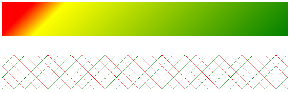
- 举例:
background-image: linear-gradient(red, yellow);效果图:
- 举例:

线性渐变的开头,可以指定一个渐变的方向:
to left:从右到左渐变
to right
to bottom
to top
xxxdeg:deg 表示度数,例如 90deg,默认是 180deg。当为 0deg 时,linear-gradient 左边的在下面,向上渐变;当为 90 deg 时,从左到右渐变;当为 180deg 时,从上到下渐变,当为 270 度时,从右到左渐变
turn:表示圈,例如 .5turn
手动指定渐变的分布情况。举例:
background-image: linear-gradient(red 0px, yellow 200px);==> 表示默认情况(设置过width为200px,height为200px),即从0过渡到200px,其他位置都是纯色repeating-linear-gradient():可以平铺的线性渐变
示例代码:
<!DOCTYPE html>
<html lang="en">
<head>
  <meta charset="UTF-8">
  <meta http-equiv="X-UA-Compatible" content="IE=edge">
  <meta name="viewport" content="width=device-width, initial-scale=1.0">
  <title>Document</title>
  <style>
    .c1 {
      height: 90px;
      background: linear-gradient(135deg, red 10%, yellow 20%, green);
    }
    .c2 {
      margin-top: 50px;
      height: 90px;
      background: linear-gradient(135deg, transparent 0, transparent 49.5%, green 49.5%, green 50.5%, transparent 50.5%, transparent 100%),
      linear-gradient(45deg, transparent 0, transparent 49.5%, red 49.5%, red 50.5%, transparent 50.5%, transparent 100%);
      background-size: 30px 30px;
    }
  </style>
</head>
<body>
  <div class="c1">

  </div>
  <div class="c2">

  </div>
</body>
</html>
2
3
4
5
6
7
8
9
10
11
12
13
14
15
16
17
18
19
20
21
22
23
24
25
26
27
28
29
30
效果图:
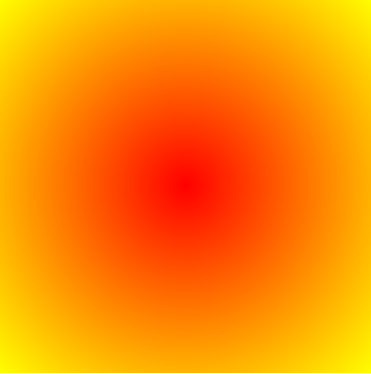
8.2 径向渐变
10个demo示例学会CSS3 radial-gradient径向渐变 « 张鑫旭-鑫空间-鑫生活 (zhangxinxu.com)open in new window,搬运一下这位仁兄的博客内容,写的超级好!
语法格式:
background: radial-gradient(start-color, ..., last-color);background: radial-gradient(shape, start-color, ..., last-color)background: radial-gradient(size at center, start-color, ..., last-color)background: radial-gradient(shape at center, start-color, ..., last-color)background: radial-gradient(size shape, start-color, ..., last-color)background: radial-gradient(size shape at center, start-color, ..., last-color)- ...
center:渐变起点的位置,可以为百分比,默认是图形的正中心。
shape:渐变的形状,ellipse 表示椭圆形,circle 表示圆形。默认为 ellipse,如果元素形状为正方形的元素,则 ellipse 和 circle 显示一样。
size:渐变的大小,即渐变到哪里停止,它有四个值。 closest-side:最近边; farthest-side:最远边; closest-corner:最近角; farthest-corner:最远角
radial-gradient():径向渐变(放射性的效果)
效果图:
默认情况下径向渐变圆心的形状来计算的:正方形 => 圆形,长方形 => 椭圆
可以手动指定径向渐变的大小:
- circle:圆
- ellipse:椭圆
- 自己指定两个值(第一、二个值都是圆心到指定值的大小)
- closest-side:渐变中心距离容器最近的边作为终止位置
- closest-corner:渐变中心距离容器最近的角作为终止位置
- farthest-side:渐变中心距离容器最远的边作为终止位置
- farthest-corner:渐变中心距离容器最远的角作为终止位置
举例:
background-image: radial-gradient(closest-corner at 60% 50%, red, yellow, black),确定了渐变起始点为 60% 50%,指定渐变终止点位置为 cloest-cornerbackground-image: radial-gradient(circle at 60% 50%, red, yellow, black),确定了渐变起始点为 60% 50%,指定渐变形状为圆background: radial-gradient(closest-side circle at 50% 50%, yellow, orange 33.33%, red 66.666%, white);,确定了渐变形状为圆,渐变起始点在 50% 50%,渐变终止点位置为 closest-side
位置:top、right、left、center、bottom、像素值例如(100px 100px)
总结:
radial-gradient(大小 at 位置, 颜色 位置, 颜色 位置)
示例代码:
<!DOCTYPE html>
<html lang="en">

<head>
  <meta charset="UTF-8">
  <meta http-equiv="X-UA-Compatible" content="IE=edge">
  <meta name="viewport" content="width=device-width, initial-scale=1.0">
  <title>Document</title>
  <style>
    div {
      width: 300px;
      height: 300px;
      background-image: radial-gradient(red, yellow, green);
      /* background-image: radial-gradient(red 5%, yellow 15%, green 60%); */
      /* background-image: radial-gradient(ellipse, red, yellow, green); */
      /* 下面确定了渐变起始点为 60% 50%,指定渐变终止点位置为 cloest-corner */
      /* background-image: radial-gradient(closest-corner at 60% 50%, red, yellow, black); */
      /* background-image: radial-gradient(circle at 60% 50%, red, yellow, black); */
      /* background: radial-gradient(closest-side circle, yellow, orange 33.33%, red 66.666%, white);*/
    }
  </style>
</head>

<body>
  <div>

  </div>
</body>

</html>
2
3
4
5
6
7
8
9
10
11
12
13
14
15
16
17
18
19
20
21
22
23
24
25
26
27
28
29
30
9. 表格(少用或不用!)
9.1 表格的简介
- 基本格式:tr 是行,td 是列
<body>
  <table border="1" width="50%" align="center">
    <tr>
      <td>A1</td>
      <td>B1</td>
      <!-- rowspan 合并行 -->
      <td rowspan="2">C1</td>
    </tr>
    <tr>
      <td>A2</td>
      <td>B2</td>
      <!-- <td>C2</td> -->
    </tr>
    <tr>
      <td>A3</td>
      <!-- colspan 合并列 -->
      <td colspan="2">B3</td>
    </tr>
  </table>
</body>
2
3
4
5
6
7
8
9
10
11
12
13
14
15
16
17
18
19
20
- rowspan 是合并行,通常要跨 tr;colspan 是合并列,在 tr 里对 td 进行合并
9.2 长表格
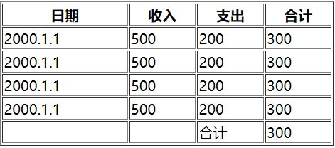
thead、tbody、tfoot、th
th:头部的单元格,字体会加粗
<body>
  <table border="1" width="50%" align="center">
    <!-- 头部(thead)、主体(tbody)、底部(tfoot) -->
    <thead>
      <tr>
        <th>日期</th>
        <th>收入</th>
        <th>支出</th>
        <th>合计</th>
      </tr>
    </thead>
    <tbody>
      <tr>
        <td>2000.1.1</td>
        <td>500</td>
        <td>200</td>
        <td>300</td>
      </tr>
      <tr>
        <td>2000.1.1</td>
        <td>500</td>
        <td>200</td>
        <td>300</td>
      </tr>
      <tr>
        <td>2000.1.1</td>
        <td>500</td>
        <td>200</td>
        <td>300</td>
      </tr>
      <tr>
        <td>2000.1.1</td>
        <td>500</td>
        <td>200</td>
        <td>300</td>
      </tr>
    </tbody>
    <tfoot>
      <tr>
        <td></td>
        <td></td>
        <td>合计</td>
        <td>300</td>
      </tr>
    </tfoot>
  </table>
</body>
2
3
4
5
6
7
8
9
10
11
12
13
14
15
16
17
18
19
20
21
22
23
24
25
26
27
28
29
30
31
32
33
34
35
36
37
38
39
40
41
42
43
44
45
46
47
9.3 表格的样式
表格无 tbody 而是直接使用 tr,浏览器会自动创建 tbody,并将 tr 全都放在 tbody 中
- border-spacing:指定边框之间的距离
- border-collapse:设置边框的合并
- 默认情况下元素在 td 中是垂直居中的,可通过 vertical-align 进行修改.除了 td,其他元素的 vertical-align 只会影响文字内容
- 根据上面的结论,若将某元素设置为单元格,则可以使用
vertical-align: middle;使该元素内部的元素垂直居中。而对于该元素内部的这个元素,可以使用margin: 0 auto;进行水平居中(都是块元素) - 设置为 table-cell 后,虽然变成了行内元素,但是它是特殊的。若还有一个 table-cell 元素则表现为行内元素同占一行,若是还有一个块元素则块元素另占一行,table-cell 表现为块元素
实例代码:
<!DOCTYPE html>
<html lang="en">
<head>
  <meta charset="UTF-8">
  <meta http-equiv="X-UA-Compatible" content="IE=edge">
  <meta name="viewport" content="width=device-width, initial-scale=1.0">
  <title>Document</title>
  <style>
    .box1 {
      width: 300px;
      height: 300px;
      background-color: orange;
      display: table-cell;
      vertical-align: middle;
    }

    .box2 {
      width: 100px;
      height: 100px;
      background-color: #bfa;
      margin: 0 auto;
    }
  </style>
</head>
<body>
  <div class="box1">
    <div class="box2"></div>
  </div>
</body>
</html>
2
3
4
5
6
7
8
9
10
11
12
13
14
15
16
17
18
19
20
21
22
23
24
25
26
27
28
29
30
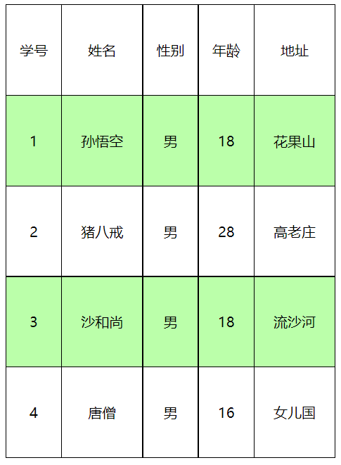
示例代码:
<!DOCTYPE html>
<html lang="en">

<head>
  <meta charset="UTF-8">
  <meta http-equiv="X-UA-Compatible" content="IE=edge">
  <meta name="viewport" content="width=device-width, initial-scale=1.0">
  <title>Document</title>
  <style>
    table {
      width: 50%;
      border: 1px solid black;
      /* 块元素,直接 margin 居中 */
      margin: 0 auto;

      /* 指定边框之间的距离,设置为 0 后只是叠加了而已,不符合要求 */
      /* border-spacing: 0px; */

      /* 设置边框的合并 */
      border-collapse: collapse;
    }

    td {
      border: 1px solid black;
      height: 100px;
      /* 默认情况下元素在 td 中是垂直居中的,可通过 vertical-align 进行修改 */
      /* 除了 td,其他元素的 vertical-align 只会影响文字内容 */
      vertical-align: middle;
      text-align: center;
    }

    /*
      table tr:nth-child(2n) --- ok
      table>tr:nth-child(2n) --- no --- 如果表格无 tbody 而是直接使用 tr,浏览器会自动创建 tbody,并将 tr 全都放在 tbody 中
      tbody>tr:nth-child(2n) --- ok --- tr 不是 table 的子元素
    */
    tbody>tr:nth-child(2n) {
      background-color: #bfa;
    }
  </style>
</head>

<body>
  <table>
    <tr>
      <td>学号</td>
      <td>姓名</td>
      <td>性别</td>
      <td>年龄</td>
      <td>地址</td>
    </tr>
    <tr>
      <td>1</td>
      <td>孙悟空</td>
      <td>男</td>
      <td>18</td>
      <td>花果山</td>
    </tr>
    <tr>
      <td>2</td>
      <td>猪八戒</td>
      <td>男</td>
      <td>28</td>
      <td>高老庄</td>
    </tr>
    <tr>
      <td>3</td>
      <td>沙和尚</td>
      <td>男</td>
      <td>18</td>
      <td>流沙河</td>
    </tr>
    <tr>
      <td>4</td>
      <td>唐僧</td>
      <td>男</td>
      <td>16</td>
      <td>女儿国</td>
    </tr>
  </table>
</body>

</html>
2
3
4
5
6
7
8
9
10
11
12
13
14
15
16
17
18
19
20
21
22
23
24
25
26
27
28
29
30
31
32
33
34
35
36
37
38
39
40
41
42
43
44
45
46
47
48
49
50
51
52
53
54
55
56
57
58
59
60
61
62
63
64
65
66
67
68
69
70
71
72
73
74
75
76
77
78
79
80
81
82
83
10. 表单
10.1 表单简介
- 最外层用 form,必填 action(表单要提交的服务器地址)
- 数据要提交到服务器中,必须要为元素指定一个 name 值
示例代码:
<!DOCTYPE html>
<html lang="en">

<head>
  <meta charset="UTF-8">
  <meta http-equiv="X-UA-Compatible" content="IE=edge">
  <meta name="viewport" content="width=device-width, initial-scale=1.0">
  <title>Document</title>
  <style>

  </style>
</head>

<body>
  <!-- action(必填):表单要提交的服务器的地址 -->
  <form action="target.html">
    <!-- 文本框 -->
    <label for="username">
      账号:<input type="text" id="username" name="username">
    </label>
    <br><br>

    <!-- 密码框 -->
    <label for="password">
      密码:<input type="password" id="password" name="password">
    </label>
    <br><br>

    <!-- 提交按钮 -->
    <input type="submit" value="注册">
    <br><br>

    <!-- 单选按钮 -->
    <!-- name 必须得一样,因为是单选框,提交数据时不能提交俩数据 -->
    <!-- 向这种选择框,必须要指定一个 value 属性以提交数据 -->
    <!-- checked 可以将单选按钮设置为默认选中 -->
    <label for="eat">
      <input type="radio" id="eat" name="hobby" value="eat" checked>吃饭
    </label>
    <label for="sleep">
      <input type="radio" id="sleep" name="hobby" value="sleep">睡觉
    </label>
    <br><br>

    <!-- 多选框 -->
    <label for="guangzhou">
      <input type="checkbox" id="guangzhou" , name="location" , value="guangzhou">广州
    </label>
    <label for="shanghai">
      <input type="checkbox" id="shanghai" , name="location" , value="shanghai">上海
    </label>
    <label for="beijing">
      <input type="checkbox" id="beijing" , name="location" , value="beijing">背景
    </label>
    <br><br>

    <!-- 下拉列表 -->
    <label for="wish">梦想:</label>
    <select name="wish" id="wish">
      <option value="travel">去旅行</option>
      <option value="eating">吃美食</option>
      <option value="reading">去阅读</option>
      <option value="listen">听音乐</option>
    </select>

  </form>
</body>

</html>
2
3
4
5
6
7
8
9
10
11
12
13
14
15
16
17
18
19
20
21
22
23
24
25
26
27
28
29
30
31
32
33
34
35
36
37
38
39
40
41
42
43
44
45
46
47
48
49
50
51
52
53
54
55
56
57
58
59
60
61
62
63
64
65
66
67
68
69
10.2 表单补充
autocomplete: "on"/autocomplete: "false":设置为 false 可以关闭浏览器自动补全表单的功能。可以在 form 标签上设置(form 里面所有的表单都不会提示了),也可以在 input 标签中进行设置readonly:input 的属性,只读,仍能提交表单disabled:input 的属性,禁用,提交表单提交不了autofocus:input 的属性,设置表单项自动获取焦点
11. 项目实战:小米官网
11.1 准备
- 引入重置样式表 reset.css、公共样式表 base.css、图标字体库 all.css、当前页面的样式表 index.css
- 部分代码:
base.css:
/* 公共样式 */
.clearfix::before,
.clearfix::after {
  content: '';
  display: table;
  clear: both;
}

/* 去除 a 的下划线 */
a {
  text-decoration: none;
  color: #333;
  /* 设置 block 使 a 的范围都能点击 */
  display: block;
}

body {
  font: 14px/1.5 Helvetica Neue,Helvetica,Arial,Microsoft Yahei,Hiragino Sans GB,Heiti SC,WenQuanYi Micro Hei,sans-serif;
  color: #333;
  /* 为了不让容器过小导致网页变形 */
  min-width: 1226px;
}

/* 设置一个类,用来表示中间容器的宽度 */
.w {
  /* 固定容器的宽度 */
  width: 1226px;
  /* 设置容器居中 */
  margin: 0 auto;
}
2
3
4
5
6
7
8
9
10
11
12
13
14
15
16
17
18
19
20
21
22
23
24
25
26
27
28
29
30
11.2 导航条结构的搭建
基本结构:
<!DOCTYPE html>
<html lang="en">

<head>
  <meta charset="UTF-8">
  <meta http-equiv="X-UA-Compatible" content="IE=edge">
  <meta name="viewport" content="width=device-width, initial-scale=1.0">
  <title>
    小米商城 - Xiaomi 11 Ultra、Redmi K40 Pro、MIX FOLD,小米电视官方网站
  </title>
  <!-- 重置样式表 -->
  <link rel="stylesheet" href="./css/reset.css">
  <!-- 引入公共样式表 -->
  <link rel="stylesheet" href="./css/base.css">
  <!-- 引入图标字体库 -->
  <link rel="stylesheet" href="./fa/css/all.css">
  <!-- 引入当前页面的样式表 -->
  <link rel="stylesheet" href="./css/index.css">
</head>

<body>
  <!-- 顶部导航条 -->
  <!-- 顶部导航条外部容器 -->
  <div class="top-bar-wrapper">
    <!-- 内部容器 -->
    <div class="topbar">
      <ul class="service">
        <li><a href="javascript:;">小米商城</a></li>
        <li class="line">|</li>
        <li><a href="javascript:;">MIUI</a></li>
        <li class="line">|</li>
        <li><a href="javascript:;">loT</a></li>
        <li class="line">|</li>
        <li><a href="javascript:;">云服务</a></li>
        <li class="line">|</li>
        <li><a href="javascript:;">天星数科</a></li>
        <li class="line">|</li>
        <li><a href="javascript:;">有品</a></li>
        <li class="line">|</li>
        <li><a href="javascript:;">小爱开放平台</a></li>
        <li class="line">|</li>
        <li><a href="javascript:;">企业团购</a></li>
        <li class="line">|</li>
        <li><a href="javascript:;">资质证照</a></li>
        <li class="line">|</li>
        <li><a href="javascript:;">协议规则</a></li>
        <li class="line">|</li>
        <li><a href="javascript:;">下载app</a></li>
        <li class="line">|</li>
        <li><a href="javascript:;">Select Location</a></li>
        <li class="line">|</li>
      </ul>

      <!-- 购物车 -->
      <ul class="shop-cart">
        <li>
          <a href="javascript:;">
            <i class="fas fa-shopping-cart"></i>
            购物车
          </a>
        </li>
      </ul>

      <!-- 用户登录注册 -->
      <ul class="user-info">
        <li><a href="javascript:;">登录</a></li>
        <li class="line">|</li>
        <li><a href="javascript:;">注册</a></li>
        <li class="line">|</li>
        <li><a href="javascript:;">消息通知</a></li>
      </ul>
    </div>
  </div>
</body>

</html>
2
3
4
5
6
7
8
9
10
11
12
13
14
15
16
17
18
19
20
21
22
23
24
25
26
27
28
29
30
31
32
33
34
35
36
37
38
39
40
41
42
43
44
45
46
47
48
49
50
51
52
53
54
55
56
57
58
59
60
61
62
63
64
65
66
67
68
69
70
71
72
73
74
75
76
11.3 导航栏基本样式
- 当鼠标悬浮购物车时,会有一个弹出层。所以在设置购物车的
:hover时,需要绑定 ul 而不是 li,这样才能实现鼠标移走后弹出层仍不消失
index.html:
<!DOCTYPE html>
<html lang="en">

<head>
  <meta charset="UTF-8">
  <meta http-equiv="X-UA-Compatible" content="IE=edge">
  <meta name="viewport" content="width=device-width, initial-scale=1.0">
  <title>
    小米商城 - Xiaomi 11 Ultra、Redmi K40 Pro、MIX FOLD,小米电视官方网站
  </title>
  <!-- 重置样式表 -->
  <link rel="stylesheet" href="./css/reset.css">
  <!-- 引入公共样式表 -->
  <link rel="stylesheet" href="./css/base.css">
  <!-- 引入图标字体库 -->
  <link rel="stylesheet" href="./fa/css/all.css">
  <!-- 引入当前页面的样式表 -->
  <link rel="stylesheet" href="./css/index.css">
</head>

<body>
  <!-- 顶部导航条 -->
  <!-- 顶部导航条外部容器 -->
  <div class="topbar-wrapper">
    <!-- 内部容器 -->
    <div class="topbar w clearfix">
      <ul class="service">
        <li><a href="javascript:;">小米商城</a></li>
        <li class="line">|</li>
        <li><a href="javascript:;">MIUI</a></li>
        <li class="line">|</li>
        <li><a href="javascript:;">loT</a></li>
        <li class="line">|</li>
        <li><a href="javascript:;">云服务</a></li>
        <li class="line">|</li>
        <li><a href="javascript:;">天星数科</a></li>
        <li class="line">|</li>
        <li><a href="javascript:;">有品</a></li>
        <li class="line">|</li>
        <li><a href="javascript:;">小爱开放平台</a></li>
        <li class="line">|</li>
        <li><a href="javascript:;">企业团购</a></li>
        <li class="line">|</li>
        <li><a href="javascript:;">资质证照</a></li>
        <li class="line">|</li>
        <li><a href="javascript:;">协议规则</a></li>
        <li class="line">|</li>
        <li><a href="javascript:;">下载app</a></li>
        <li class="line">|</li>
        <li><a href="javascript:;">Select Location</a></li>
      </ul>

      <!-- 购物车 -->
      <ul class="shop-cart">
        <li>
          <a href="javascript:;">
            <i class="fas fa-shopping-cart"></i>
            购物车(0)
          </a>
        </li>
      </ul>

      <!-- 用户登录注册 -->
      <ul class="user-info">
        <li><a href="javascript:;">登录</a></li>
        <li class="line">|</li>
        <li><a href="javascript:;">注册</a></li>
        <li class="line">|</li>
        <li><a href="javascript:;">消息通知</a></li>
      </ul>
    </div>
  </div>
</body>

</html>
2
3
4
5
6
7
8
9
10
11
12
13
14
15
16
17
18
19
20
21
22
23
24
25
26
27
28
29
30
31
32
33
34
35
36
37
38
39
40
41
42
43
44
45
46
47
48
49
50
51
52
53
54
55
56
57
58
59
60
61
62
63
64
65
66
67
68
69
70
71
72
73
74
75
index.css:
/* 主页 index.html 的样式表 */

/* 顶部导航条的容器 */
.topbar-wrapper {
  width: 100%;
  background-color: #333;
  height: 40px;
  line-height: 40px;
}

/* 设置超链接颜色 */
.topbar a {
  font-size: 12px;
  color: #b0b0b0;
}

/* 设置超链接移入的效果 */
.topbar a:hover {
  color: #fff;
}

/* 设置中间分割线 */
.topbar .line {
  font-size: 12px;
  color: #414141;
  margin: 0 8px;
  margin-top: -1px;
}

/* 设置左侧导航栏 */
.service, .topbar li {
  float: left;
}

/* 设置右侧导航栏 */
.shop-cart, .user-info {
  float: right;
}

.shop-cart {
  margin-left: 26px;
}

/* 设置购物车的样式 */
.shop-cart a {
  width: 120px;
  background-color: #424242;
  text-align: center;
}

.shop-cart:hover a {
  background-color: #fff;
  color: #ff6a00;
}

.shop-cart i {
  margin-right: 2px;
}
2
3
4
5
6
7
8
9
10
11
12
13
14
15
16
17
18
19
20
21
22
23
24
25
26
27
28
29
30
31
32
33
34
35
36
37
38
39
40
41
42
43
44
45
46
47
48
49
50
51
52
53
54
55
56
57
58
base.css:见上面
11.4 二维码下拉
- “小米商城app” 这行字会显示在包裹图片的区域下侧而不是图片下侧,是因为它属于导航条的子元素,导航条设置了 line-height,而 line-height 具有继承性,原本有 40px 的行高,于是这行字继承了下来。要想解决这个问题,可以手动设置这行字为:
line-height: 1(100%),使之会根据该元素本身的字体大小设置行高 - box-shadow 的用法见上,最常用的卡片式写法:
box-shadow: 0 0 10px rgba(0, 0, 0, .3)
如何实现三角箭头?
引入:border 的一些巧妙用法
<style>
    .box1 {
        width: 10px;
        height: 10px;
        border: 10px red solid;
        border-color: red orange blue yellow;
    }
</style>
<div class="box1"></div>
2
3
4
5
6
7
8
9

当 width = height = 0 时,就是四个小三角形了!
生成向上的箭头,只需要设置 border-top: none,这时候两侧的无法去除,可以更改 border-color,设置为:border-color: transparent transparent blue transparent; 得到蓝色的向上箭头。代码如下:
.box1 {
    width: 0;
    height: 0;
    border: 10px red solid;
    border-color: transparent transparent blue transparent; /* 上右下左,设置下边框为 blue 就能得到向上 */
    border-top: none;
}
2
3
4
5
6
7
将上箭头指向 “下载app” 实现:
.app {
  position: relative;
}

/* 设置app下的小三角 */
.app::after {
  content: '';
  /* 设置定位后变成了块元素 */
  position: absolute;
  /* 将元素定位到最底端 */
  bottom: 0;

  /* 这三个设置使定位的块元素进行水平居中 */
  left: 0;
  right: 0;
  margin: auto;

  /* 下面的设置就是设置上箭头的纯css写法 */
  width: 0;
  height: 0;
  /* 设置四个方向的边框 */
  border: 10px solid transparent;
  /* 去除上边框 */
  border-top: none;
  /* 单独设置下边框的颜色 */
  border-bottom-color: #fff;
}
2
3
4
5
6
7
8
9
10
11
12
13
14
15
16
17
18
19
20
21
22
23
24
25
26
27
11.5 购物车下拉
- 由于悬浮框有阴影,会导致购物车与悬浮窗之间会有一层阴影,解决办法:设置悬浮窗的
z-index: -1; - 由于悬浮窗内的 span 里的这些字是行内元素,无法居中对齐,所以可以设置:
display: block;
效果图:
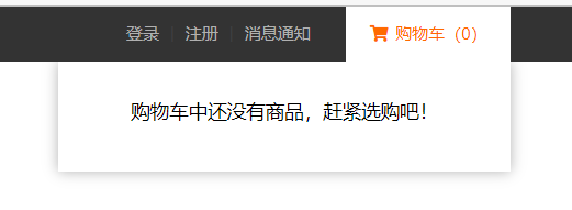
index.html:
<!-- 购物车 -->
<ul class="shop-cart">
    <li>
        <a href="javascript:;">
            <i class="fas fa-shopping-cart"></i>
            购物车(0)
            <div class="shop-detail">
                <span>购物车中还没有商品,赶紧选购吧!</span>
            </div>
        </a>
    </li>
</ul>
2
3
4
5
6
7
8
9
10
11
12
index.css:
/* 设置右侧导航栏 */
.shop-cart, .user-info {
  float: right;
}

.shop-cart {
  margin-left: 26px;
  position: relative;
}

/* 设置购物车的样式 */
.shop-cart a {
  width: 120px;
  background-color: #424242;
  text-align: center;
}

.shop-cart:hover a {
  background-color: #fff;
  color: #ff6a00;
}

.shop-cart:hover .shop-detail {
  display: block;
  height: 80px;
}

.shop-cart i {
  margin-right: 2px;
}

.shop-cart .shop-detail {
  z-index: -1;
  position: absolute;
  line-height: 1;
  left: -210px;
  /* height: 80px; */
  height: 0;
  overflow: hidden;
  width: 330px;
  background-color: #fff;
  box-shadow: 0px 0px 10px rgba(0, 0, 0, .3);
  transition: height, 0.3s;
}

.shop-cart .shop-detail span {
  display: block;
  margin: 30px auto;
  color: #000;
  font-size: 14px;
}
2
3
4
5
6
7
8
9
10
11
12
13
14
15
16
17
18
19
20
21
22
23
24
25
26
27
28
29
30
31
32
33
34
35
36
37
38
39
40
41
42
43
44
45
46
47
48
49
50
51
11.6 头部 logo 动画
transition: left 0.3s;中,必须有 left 初始值才能进行动画
代码:
index.html:
<!-- 创建一个头部的外部容器 -->
<div class="header-wrapper">
    <div class="header w clearfix">
        <!-- 创建一个logo -->
        <h1 class="logo" title="xiaomi">
            <a class="home" href="/" title="小米官网" alt="小米图标1"></a>
            <a class="mi" href="/" title="小米官网" alt="小米图标2"></a>
        </h1>
    </div>
</div>
2
3
4
5
6
7
8
9
10
index.js:
.header {
  height: 100px;
  background-color: #bfa;
}

/* 设置logo的h1 */
.header .logo {
  float: left;
  margin-top: 22px;
  width: 55px;
  height: 55px;
  position: relative;
  overflow: hidden;
}

/* 统一设置logo的超链接 */
.header .logo a {
  position: absolute;
  width: 55px;
  height: 55px;
  background-color: #ff6700;
  background-image: url(https://s02.mifile.cn/assets/static/image/logo-mi2.png);
  background-position: center;
  background-size: contain;
  border-radius: 20px;
  left: 0;
  transition: left 0.3s;
}

/* 设置home图片 */
.header .logo .home {
  background-image: url(https://cn.vuejs.org/images/logo.svg);
  background-position: center;
  background-size: contain;
  background-color: #bfa;
  border-radius: 20px;
  left: -55px;
}

/* 设置鼠标移入以后两个图标的位置 */
.header .logo:hover .mi {
  left: 55px;
}

.header .logo:hover .home {
  left: 0;
}
2
3
4
5
6
7
8
9
10
11
12
13
14
15
16
17
18
19
20
21
22
23
24
25
26
27
28
29
30
31
32
33
34
35
36
37
38
39
40
41
42
43
44
45
46
47
11.7 visibility 和 display
visibility: hidden:仍会占据页面空间display: none:元素会消失,不占据页面空间
11.8 头部导航下拉层
index.html:
<!-- 创建一个中间导航条的容器 -->
<div class="nav-wrapper">
  <!-- 创建导航条 -->
  <ul class="nav clearfix">
    <li><a class="all-goods" href="javascript:;">全部商品分类</a></li>
    <li class="show-goods"><a href="javascript:;">小米手机</a></li>
    <li class="show-goods"><a href="javascript:;">Redmi 红米</a></li>
    <li class="show-goods"><a href="javascript:;">电视</a></li>
    <li class="show-goods"><a href="javascript:;">笔记本</a></li>
    <li class="show-goods"><a href="javascript:;">家电</a></li>
    <li class="show-goods"><a href="javascript:;">路由器</a></li>
    <li class="show-goods"><a href="javascript:;">智能硬件</a></li>
    <li><a href="javascript:;">服务</a></li>
    <li><a href="javascript:;">社区</a></li>

    <!-- 创建一个弹出层 -->
    <div class="goods-info"></div>
  </ul>
</div>
2
3
4
5
6
7
8
9
10
11
12
13
14
15
16
17
18
19
index.css:
/* 设置中间的导航条 */
.header .nav-wrapper {
  float: left;
  margin-left: 7px;
}

/* 设置导航条 */
.header .nav {
  /* background-color: #bfa; */
  height: 100px;
  line-height: 100px;
  padding-left: 58px;
}

/* 设置导航条中的 li */
.nav-wrapper li {
  float: left;
  margin-right: 20px;
}

.nav-wrapper li a {
  display: block;
  font-size: 16px;
}

.nav-wrapper li a:hover {
  color: #ff6700;
}

/* 隐藏全部商品 */
.all-goods {
  visibility: hidden;
}

.nav .goods-info {
  /* height: 228px; */
  height: 0;
  overflow: hidden;
  width: 100%;
  /* background-color: #bfa; */
  position: absolute;
  top: 100px;
  left: 0;
  transition: height 0.3s;
  z-index: 9999;
}

.nav .show-goods:hover ~ .goods-info,
.goods-info:hover {
  height: 228px;
  border-top: 1px solid rgb(224, 224, 224);
  box-shadow: 0 5px 3px rgba(0, 0, 0, .2);
}
2
3
4
5
6
7
8
9
10
11
12
13
14
15
16
17
18
19
20
21
22
23
24
25
26
27
28
29
30
31
32
33
34
35
36
37
38
39
40
41
42
43
44
45
46
47
48
49
50
51
52
53
示意图:
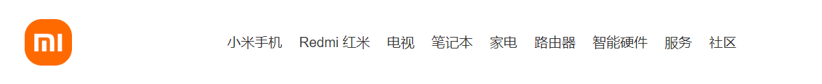
11.9 右侧的搜索框
index.html:
<!-- 创建搜索框的容器 -->
<div class="search-wrapper">
  <form class="search" action="#">
    <input class="search-inp" type="text" >
    <button class="search-btn">
      <i class="fas fa-search"></i>
    </button>
  </form>
</div>
2
3
4
5
6
7
8
9
index.css:
/* 设置搜索框容器 */
.search-wrapper {
  width: 296px;
  height: 50px;
  background-color: red;
  float: right;
  margin-top: 25px;
}

.search-wrapper .search-inp {
  box-sizing: border-box;
  width: 244px;
  float: left;
  height: 50px;
  border: none;
  padding: 0 10px;
  font-size: 16px;
  border: none;
  outline: none;
  border: 1px solid rgb(224, 224, 224);
}

/* 设置 input 获取焦点后的样式 */
.search-wrapper .search-inp:focus,
.search-wrapper .search-inp:focus + button {
  border-color: #ff6700;
}

.search-wrapper .search-btn {
  float: left;
  height: 50px;
  width: 52px;
  padding: 0;
  border: none;
  background-color: #fff;
  color: #616161;
  font-size: 16px;
  border: 1px solid rgb(224, 224, 224);
  border-left: none;
}

.search-wrapper .search-btn:hover {
  background-color: #ff6700;
  color: white;
  border: none;
  cursor: pointer;
}
2
3
4
5
6
7
8
9
10
11
12
13
14
15
16
17
18
19
20
21
22
23
24
25
26
27
28
29
30
31
32
33
34
35
36
37
38
39
40
41
42
43
44
45
46
47
示意图:

11.10 重点 - 固定工具栏到 banner 右边
index.html:
<div class="back-top"></div>
index.css:
/* 设置回到顶部的元素 */
.back-top {
  width: 26px;
  height: 206px;
  background-color: orange;
  /* 开启固定定位 */
  position: fixed;
  bottom: 100px;
  /* 视口的宽度 = left + margin-left + width + margin-right + right */
  /* 视口宽度 = auto + 0 + 26 + 0 + 50% */
  /* 修改 margin-left 为 -100px,会自动令 left = +100px,等于没有加 */
  /* 所以要让 margin-right 为 -100px,这样 left = 100px,就能使该元素向右移动 100px 了 */
  right: 50%;
  margin-right: -639px;
}
2
3
4
5
6
7
8
9
10
11
12
13
14
15
这样,工具栏紧紧就会紧紧贴着 banner 右侧
示意图:
11.11 创建广告容器
index.html:
<!-- 创建广告容器 -->
<div class="ad w">
  <ul class="shortcut">
    <li>
      <a href="#">
        <i class="fas fa-clock"></i>
        小米秒杀
      </a>
    </li>
    <li>
      <a href="#">
        <i class="fas fa-building"></i>
        企业团购
      </a>
    </li>
    <li>
      <a href="#">
        <i class="fas fa-frog"></i>
        F码通道
      </a>
    </li>
    <li>
      <a href="#">
        <i class="fas fa-robot"></i>
        米粉卡
      </a>
    </li>
    <li>
      <a href="#">
        <i class="fas fa-keyboard"></i>
        以旧换新
      </a>
    </li>
    <li>
      <a href="#">
        <i class="fas fa-sim-card"></i>
        话费充值
      </a>
    </li>
  </ul>

  <ul class="imgs">
    <li>
      <a href="javascript:;">
        <img src="../static/1.jpg" alt="">
      </a>
    </li>
    <li>
      <a href="javascript:;">
        <img src="../static/2.jpg" alt="">
      </a>
    </li>
    <li>
      <a href="javascript:;">
        <img src="../static/3.jpg" alt="">
      </a>
    </li>
  </ul>
</div>
2
3
4
5
6
7
8
9
10
11
12
13
14
15
16
17
18
19
20
21
22
23
24
25
26
27
28
29
30
31
32
33
34
35
36
37
38
39
40
41
42
43
44
45
46
47
48
49
50
51
52
53
54
55
56
57
58
59
index.css:
/* 设置下部的广告区域 */
.ad {
  /* background-color: red; */
  height: 170px;
  margin-top: 14px;
}

.ad .shortcut,
.ad .imgs,
.ad li {
  float: left;
}

/* 设置左侧快捷方式 */
.ad .shortcut {
  width: 228px;
  height: 168px;
  background-color: #5f5750;
  margin-right: 14px;
  padding-top: 2px;
  padding-left: 6px;
}

.ad .shortcut li {
  position: relative;
}

/* 设置上边框 */
.ad .shortcut li::before {
  content: '';
  position: absolute;
  width: 64px;
  height: 1px;
  background-color: #665e57;
  left: 0;
  top: 0;
  right: 0;
  margin: 0 auto;
}

/* 设置左边框 */
.ad .shortcut li::after {
  content: '';
  position: absolute;
  height: 70px;
  width: 1px;
  background-color: #665e57;
  top: 0;
  bottom: 0;
  left: 0;
  margin: auto 0;
}

/* 设置快捷方式中的超链接 */
.ad .shortcut a {
  display: block;
  color: #cfccca;
  width: 76px;
  height: 84px;
  text-align: center;
  font-size: 12px;
  overflow: hidden;
}

.ad .shortcut a:hover {
  color: #fff;
}

/* 设置图标字体 */
.ad .shortcut i {
  display: block;
  margin-top: 20px;
  font-size: 20px;
}

/* 设置右侧图片 */
.ad .imgs li {
  width: 316px;
  margin-right: 15px;
}

.ad .imgs li:last-child {
  margin: 0;
}

.ad .imgs img {
  width: 100%;
  vertical-align: bottom;
}
2
3
4
5
6
7
8
9
10
11
12
13
14
15
16
17
18
19
20
21
22
23
24
25
26
27
28
29
30
31
32
33
34
35
36
37
38
39
40
41
42
43
44
45
46
47
48
49
50
51
52
53
54
55
56
57
58
59
60
61
62
63
64
65
66
67
68
69
70
71
72
73
74
75
76
77
78
79
80
81
82
83
84
85
86
87
88
89
示意图:
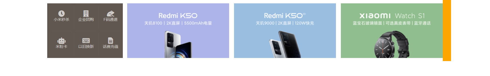
11.12 设置网站图标
index.html:
<link rel="icon" href="./favicon.ico">
12. 过渡与动画
12.1 过渡 - transition
通过过渡可以指定一个属性发生变化时的切换方式。过渡时必须是从一个有效值向另外一个有效值进行过渡
常见属性:
transition-property:指定要执行过渡的属性,多个属性用逗号隔开。如果所有属性都需要过渡,则可以使用 all 关键字transition-durantion:指定过渡效果持续时间。多个属性用逗号隔开(例如transition-property: width, height,然后分别设置width和height的动画持续时间,可以设置transition-duration: .6s, 1000ms)transition-timing-function:过渡的时序函数,指定过渡的执行方式ease:默认值,慢速开始,先加速,再减速linear:匀速运动ease-in:加速运动(慢速开始,越来越快)ease-out:减速运动(快速开始,越来越慢)ease-in-out:先加速,后减速,没有 ease 那么匀速,中间有些快cubic-bezier():贝塞尔曲线设置open in new windowsteps():分步执行过渡效果。第一个参数为数字,表示分几步执行完(类似于跳帧,如果数字为 2,则为两帧,第一帧跳到距离的一半,第二帧跳到末尾);第二个参数为start或end,end表示在时间结束时执行过渡,start表示在时间开启时执行过渡
transition-delay:表示过渡效果的延迟,等待一段时间后再执行过渡transition:简写属性,可以同时设置过渡相关的所有属性。只有一个要求,如果要写延迟,则两个时间中,第一个是持续时间,第二个是延迟
示例代码:
<!DOCTYPE html>
<html lang="en">

<head>
  <meta charset="UTF-8">
  <meta http-equiv="X-UA-Compatible" content="IE=edge">
  <meta name="viewport" content="width=device-width, initial-scale=1.0">
  <title>Document</title>
  <style>
    * {
      margin: 0;
      padding: 0;
    }

    .box1 {
      width: 800px;
      height: 800px;
      background-color: silver;
      overflow: hidden;
    }

    .box1 div {
      width: 100px;
      height: 100px;
      margin-bottom: 100px;
      margin-left: 0;
    }

    .box2 {
      background-color: orange;
      transition: margin-left 2s 1s cubic-bezier(.86, .15, .24, .94);
    }

    .box3 {
      background-color: orange;
      transition-property: all;
      transition-duration: 2s;
      transition-timing-function: cubic-bezier(.86, .15, .24, .94);
      transition-delay: 2s;
    }

    .box1:hover div {
      width: 100px;
      height: 100px;
      background-color: orange;
      margin-left: 700px;
    }
  </style>
</head>

<body>
  <div class="box1">
    <div class="box2">2</div>
    <div class="box3">3</div>
  </div>
</body>

</html>
2
3
4
5
6
7
8
9
10
11
12
13
14
15
16
17
18
19
20
21
22
23
24
25
26
27
28
29
30
31
32
33
34
35
36
37
38
39
40
41
42
43
44
45
46
47
48
49
50
51
52
53
54
55
56
57
58
12.2 动画 - animation
关键帧设置了动画执行每一个步骤
常见属性:(与 transition 的属性基本一致)
animation-name:要对当前元素生效的关键帧的名字animation-duration:动画的执行时间animation-delay:动画的延时animation-timing-function:动画时序函数animation-iteration-count:动画执行次数,可选值为数字或者infinite(无限执行)animation-direction:指定动画运行的方向。属性值:normal:从 from 到 to 运行reverse:从 to 到 from 运行alternate:从 from 到 to 运行,重复执行动画时反向执行alternate-reverse:从 to 到 from 运行,重复执行动画时反向执行
animation-play-state:设置动画的执行状态。属性值:running:默认值,动画执行paused:动画暂停,可以放在:hover的后面
animation-fill-mode:动画的填充模式。属性值:none:动画执行完毕元素回到原来位置forwards:动画执行完毕元素停止到动画结束的位置backwards:动画延时等待时,元素就会处于开始位置。animation-delay配合animation-fill-mode的backwards,在动画延时等待时,元素就会处于开始位置(from 的状态)both:结合了前两者,延时的时候直接处于开始位置,动画执行完毕的时候停止到动画结束的位置
animation:简写属性。只有一个要求,如果要写延迟,则两个时间中,第一个是持续时间,第二个是延迟
基本形式:
<!DOCTYPE html>
<html lang="en">

<head>
  <meta charset="UTF-8">
  <meta http-equiv="X-UA-Compatible" content="IE=edge">
  <meta name="viewport" content="width=device-width, initial-scale=1.0">
  <title>Document</title>
  <style>
    * {
      margin: 0;
      padding: 0;
    }

    .box1 {
      width: 800px;
      height: 800px;
      background-color: silver;
      overflow: hidden;
    }

    .box1:hover .box2 {
      animation-play-state: paused;
    }

    .box2 {
      width: 100px;
      height: 100px;
      margin-bottom: 100px;
      margin-left: 10px;
      background-color: #bfa;

      /* 设置 box2 的动画 */
      animation-name: test;
      animation-duration: 2s;
      /*  */
      animation-delay: 2s;
      animation-timing-function: ease-in;
      animation-iteration-count: 1;
      animation-direction: alternate;
      animation-fill-mode: both;
    }

    @keyframes test {

      /* to 动画的开始位置,也可以用 0% */
      from {
        margin-left: 0;
        background-color: orange;
      }

      /* from 动画的结束位置,也可以用 100% */
      to {
        margin-left: 700px;
        background-color: red;
      }
    }
  </style>
</head>

<body>
  <div class="box1">
    <div class="box2">2</div>
  </div>
</body>

</html>
2
3
4
5
6
7
8
9
10
11
12
13
14
15
16
17
18
19
20
21
22
23
24
25
26
27
28
29
30
31
32
33
34
35
36
37
38
39
40
41
42
43
44
45
46
47
48
49
50
51
52
53
54
55
56
57
58
59
60
61
62
63
64
65
66
67
12.3 奔跑的少年
<!DOCTYPE html>
<html lang="en">

<head>
  <meta charset="UTF-8">
  <meta http-equiv="X-UA-Compatible" content="IE=edge">
  <meta name="viewport" content="width=device-width, initial-scale=1.0">
  <title>Document</title>
  <style>
    .box1 {
      height: 256px;
      width: 256px;
      margin: 0 auto;
      background-image: url('./img/bg2.png');
      animation: run 1s steps(6) infinite;
    }

    /* 创建关键帧 */
    @keyframes run {
      from {
        background-position: 0 0;
      }

      to {
        background-position: -1536px 0;
      }
    }
  </style>
</head>

<body>
  <div class="box1"></div>
</body>

</html>
2
3
4
5
6
7
8
9
10
11
12
13
14
15
16
17
18
19
20
21
22
23
24
25
26
27
28
29
30
31
32
33
34
35
12.4 小球弹弹弹
<!DOCTYPE html>
<html lang="en">

<head>
  <meta charset="UTF-8">
  <meta http-equiv="X-UA-Compatible" content="IE=edge">
  <meta name="viewport" content="width=device-width, initial-scale=1.0">
  <title>Document</title>
  <style>
    .outer {
      height: 500px;
      margin: 50px auto;
      overflow: hidden;
      border: 10px solid blue;
    }

    .outer div {
      float: left;
      width: 100px;
      height: 100px;
      border-radius: 50%;
      background-color: #bfa;
      animation: ball .3s forwards linear infinite alternate;
    }

    div.box1 {
      background-color: orange;
    }

    div.box2 {
      background-color: yellow;
      animation-delay: .1s;
    }

    div.box3 {
      background-color: yellowgreen;
      animation-delay: .2s;
    }

    div.box4 {
      background-color: blue;
      animation-delay: .3s;
    }

    div.box5 {
      background-color: pink;
      animation-delay: .4s;
    }

    div.box6 {
      background-color: tomato;
      animation-delay: .5s;
    }

    div.box7 {
      background-color: chocolate;
      animation-delay: .6s;
    }

    /* 创建小球下落动画 */
    @keyframes ball {
      from {
        margin-top: 0;
      }

      to {
        margin-top: 400px;
      }
    }
  </style>
</head>

<body>
  <div class="outer">
    <div class="box1"></div>
    <div class="box2"></div>
    <div class="box3"></div>
    <div class="box4"></div>
    <div class="box5"></div>
    <div class="box6"></div>
    <div class="box7"></div>
  </div>
</body>

</html>
2
3
4
5
6
7
8
9
10
11
12
13
14
15
16
17
18
19
20
21
22
23
24
25
26
27
28
29
30
31
32
33
34
35
36
37
38
39
40
41
42
43
44
45
46
47
48
49
50
51
52
53
54
55
56
57
58
59
60
61
62
63
64
65
66
67
68
69
70
71
72
73
74
75
76
77
78
79
80
81
82
83
84
85
12.5 变形平移 - transform
变形就是指通过 css 改变元素的形状或位置,且变形不会影响到页面的布局,不会导致脱离文档流,不影响其他元素
平移:
translateX():沿着 X 轴方向平移。正值向右移,负值向左移。若为 50%,则是相对于自己的宽度的 50% 计算的translateY():沿着 Y 轴方向平移translateZ():沿着 Z 轴方向平移
一个新的居中方式:
原来的定位元素,可以设置
left、right、top、bottom为 0,且margin: auto;来实现,但是,这种居中方式,只适用于元素的大小是确定的(width、height 已确定)如果定位元素的大小是由内容撑开,而不是确定的,那么居中方式为:
left: 50%;
top: 50%;
transform: translateX(-50%) translateY(-50%);
1
2
3
12.6 卡片弹出效果
<!DOCTYPE html>
<html lang="en">

<head>
  <meta charset="UTF-8">
  <meta http-equiv="X-UA-Compatible" content="IE=edge">
  <meta name="viewport" content="width=device-width, initial-scale=1.0">
  <title>Document</title>
  <style>
    body {
      background-color: silver;
    }

    .box1 {
      float: left;
      width: 200px;
      height: 300px;
      background-color: #fff;
      margin-top: 100px;
      margin-left: 100px;
      margin-right: 10px;
      transition: all .2s;
    }

    .box2 {
      float: left;
      width: 200px;
      height: 300px;
      margin-top: 100px;
      background-color: #fff;
      transition: all .2s;
    }

    .box1:hover {
      transform: translateY(-4px);
      box-shadow: 0 0 10px rgba(0, 0, 0, .3);
    }

    .box2:hover {
      transform: translateY(-4px);
      box-shadow: 0 0 10px rgba(0, 0, 0, .3);
    }
  </style>
</head>

<body>
  <div class="box1"></div>
  <div class="box2"></div>
</body>

</html>
2
3
4
5
6
7
8
9
10
11
12
13
14
15
16
17
18
19
20
21
22
23
24
25
26
27
28
29
30
31
32
33
34
35
36
37
38
39
40
41
42
43
44
45
46
47
48
49
50
51
12.7 z 轴平移
z 轴平移,就是调整元素和人眼之间的距离。
z 轴平移属于立体效果(近大远小),默认情况下网页是不支持透视的。
如果需要看见效果,必须要设置网页的视距:
body {
  /* 设置当前网页的视距为 800px,人眼距离网页的距离 */
  perspective: 800px;
}
2
3
4
基本效果:
<!DOCTYPE html>
<html lang="en">

<head>
  <meta charset="UTF-8">
  <meta http-equiv="X-UA-Compatible" content="IE=edge">
  <meta name="viewport" content="width=device-width, initial-scale=1.0">
  <title>Document</title>
  <style>
    body {
      border: 1px red solid;
      background-color: silver;
      perspective: 800px;
    }

    .box1 {
      width: 200px;
      height: 200px;
      background-color: #bfa;
      margin: 200px auto;
      transition: transform 1s;
    }

    body:hover .box1 {
      transform: translateZ(400px);
    }
  </style>
</head>

<body>
  <div class="box1"></div>
</body>

</html>
2
3
4
5
6
7
8
9
10
11
12
13
14
15
16
17
18
19
20
21
22
23
24
25
26
27
28
29
30
31
32
33
34
12.8 旋转
transform 关于旋转的常见属性:
rotateX():沿着 x 轴旋转(上下旋转,类似趴下),正值往上转rotateY():沿着 y 轴旋转(左右旋转,类似开门),正值往左转rotateZ():沿着 z 轴旋转(旋转轴对向人眼,类似风车),正值顺时针转
其他属性:
backface-visibility:是否显示元素的背面。属性值:hidden:不显示visible:默认值
示例代码:
<!DOCTYPE html>
<html lang="en">

<head>
  <meta charset="UTF-8">
  <meta http-equiv="X-UA-Compatible" content="IE=edge">
  <meta name="viewport" content="width=device-width, initial-scale=1.0">
  <title>Document</title>
  <style>
    body {
      border: 1px red solid;
      background-color: silver;
      perspective: 800px;
    }

    .box1 {
      width: 200px;
      height: 200px;
      background-color: #bfa;
      margin: 200px auto;
      transition: 1s;
    }

    body:hover .box1 {
      /* transform: rotateZ(360deg); */
      /* transform: rotateZ(1turn); */
      /* transform: rotateX(45deg); */
      /* 先移再转 */
      /* transform: rotateY(180deg) translateZ(100px); */
      /* 先转再移 */
      /* transform: translateZ(100px) rotateY(180deg); */
      transform: rotateY(180deg);
    }
  </style>
</head>

<body>
  <div class="box1">
    1
  </div>
</body>

</html>
2
3
4
5
6
7
8
9
10
11
12
13
14
15
16
17
18
19
20
21
22
23
24
25
26
27
28
29
30
31
32
33
34
35
36
37
38
39
40
41
42
43
12.9 钟表
难点:秒针一直沿着线的中心转,而不是沿着头转
解决办法:设置一个父容器,让父容器旋转
<!DOCTYPE html>
<html lang="en">

<head>
  <meta charset="UTF-8">
  <meta http-equiv="X-UA-Compatible" content="IE=edge">
  <meta name="viewport" content="width=device-width, initial-scale=1.0">
  <title>Document</title>
  <style>
    * {
      margin: 0;
      padding: 0;
    }

    .sec-wrapper {
      width: 500px;
      height: 500px;
      /* background-color: #bfa;  */
      margin: 200px 200px;
      animation: run 60s;
    }

    .sec {
      height: 250px;
      width: 4px;
      background-color: red;
      margin: 0 auto;
    }

    @keyframes run {
      from {
        transform: rotateZ(0);
      }

      to {
        transform: rotateZ(360deg);
      }
    }
  </style>
</head>

<body>
  <div class="sec-wrapper">
    <div class="sec"></div>
  </div>

</body>

</html>
2
3
4
5
6
7
8
9
10
11
12
13
14
15
16
17
18
19
20
21
22
23
24
25
26
27
28
29
30
31
32
33
34
35
36
37
38
39
40
41
42
43
44
45
46
47
48
49
完整钟表:
<!DOCTYPE html>
<html lang="en">

<head>
  <meta charset="UTF-8">
  <meta http-equiv="X-UA-Compatible" content="IE=edge">
  <meta name="viewport" content="width=device-width, initial-scale=1.0">
  <title>Document</title>
  <style>
    * {
      margin: 0;
      padding: 0;
    }

    /* 设置表的样式 */
    .clock {
      position: relative;
      width: 500px;
      height: 500px;
      /* background-color: #bfa; */
      margin: 0 auto;
      margin-top: 100px;
      border-radius: 50%;
      border: 10px solid black;
    }

    .clock>div {
      position: absolute;
      top: 0;
      bottom: 0;
      left: 0;
      right: 0;
      margin: auto;
    }

    /* 设置时针 */
    .hour-wrapper {
      height: 70%;
      width: 70%;
      animation: run 21600s linear infinite;
      /* background-color: #bfa; */
    }

    .hour {
      height: 50%;
      width: 6px;
      background-color: #000;
      margin: 0 auto;
    }

    .min-wrapper {
      height: 80%;
      width: 80%;
      animation: run 3600s linear infinite;
      /* background-color: #bfa; */
    }

    .min {
      height: 50%;
      width: 4px;
      background-color: #000;
      margin: 0 auto;
    }

    .sec-wrapper {
      height: 95%;
      width: 90%;
      animation: run 60s linear infinite;
      /* background-color: #bfa; */
    }

    .sec {
      height: 50%;
      width: 2px;
      background-color: #f00;
      margin: 0 auto;
    }

    @keyframes run {
      from {
        transform: rotateZ(0deg);
      }

      to {
        transform: rotateZ(360deg);
      }
    }
  </style>
</head>

<body>
  <!-- 创建表的容器 -->
  <div class="clock">
    <!-- 创建时针 -->
    <div class="hour-wrapper">
      <div class="hour"></div>
    </div>

    <!-- 创建分针 -->
    <div class="min-wrapper">
      <div class="min"></div>
    </div>

    <!-- 创建秒针 -->
    <div class="sec-wrapper">
      <div class="sec"></div>
    </div>
  </div>
</body>

</html>
2
3
4
5
6
7
8
9
10
11
12
13
14
15
16
17
18
19
20
21
22
23
24
25
26
27
28
29
30
31
32
33
34
35
36
37
38
39
40
41
42
43
44
45
46
47
48
49
50
51
52
53
54
55
56
57
58
59
60
61
62
63
64
65
66
67
68
69
70
71
72
73
74
75
76
77
78
79
80
81
82
83
84
85
86
87
88
89
90
91
92
93
94
95
96
97
98
99
100
101
102
103
104
105
106
107
108
109
110
111
12.10 旋转魔方
效果图:
<!DOCTYPE html>
<html lang="en">

<head>
  <meta charset="UTF-8">
  <meta http-equiv="X-UA-Compatible" content="IE=edge">
  <meta name="viewport" content="width=device-width, initial-scale=1.0">
  <title>Document</title>
  <style>
    body {
      perspective: 800px;
    }
    .cube {
      width: 200px;
      height: 200px;
      /* background-color: #bfa; */
      margin: 100px auto;
      /* 设置 3D 变形效果 */
      transform-style: preserve-3d;
      /* transform: rotateX(45deg) rotateZ(45deg); */
      animation: rotate 20s infinite linear;
    }

    .cube>div {
      width: 200px;
      height: 200px;
      opacity: 0.7;
      position: absolute;
    }

    img {
      vertical-align: bottom;
    }

    .box1 {
      transform: rotateY(90deg) translateZ(100px);
    }

    .box2 {
      transform: rotateY(-90deg) translateZ(100px);
    }

    .box3 {
      transform: rotateX(90deg) translateZ(100px);
    }

    .box4 {
      transform: rotateX(-90deg) translateZ(100px);
    }

    .box5 {
      transform: rotateY(180deg) translateZ(100px);
    }

    .box6 {
      transform: rotateY(0deg) translateZ(100px);
    }

    @keyframes rotate {
      from {
        transform: rotateX(0) rotateZ(0);
      }
      to {
        transform: rotateX(1turn) rotateZ(1turn);
      }
    }
  </style>
</head>

<body>
  <!-- 创建一个外部容器 -->
  <div class="cube">
    <!-- 引入图片 -->
    <div class="box1">
      <img src="./img/1.jpg">
    </div>

    <div class="box2">
      <img src="./img/2.jpg">
    </div>

    <div class="box3">
      <img src="./img/3.jpg">
    </div>

    <div class="box4">
      <img src="./img/4.jpg">
    </div>

    <div class="box5">
      <img src="./img/5.jpg">
    </div>

    <div class="box6">
      <img src="./img/6.jpg">
    </div>
  </div>
</body>

</html>
2
3
4
5
6
7
8
9
10
11
12
13
14
15
16
17
18
19
20
21
22
23
24
25
26
27
28
29
30
31
32
33
34
35
36
37
38
39
40
41
42
43
44
45
46
47
48
49
50
51
52
53
54
55
56
57
58
59
60
61
62
63
64
65
66
67
68
69
70
71
72
73
74
75
76
77
78
79
80
81
82
83
84
85
86
87
88
89
90
91
92
93
94
95
96
97
98
99
100
12.11 缩放 - transform
属性有:scaleX()、scaleY()、scale
举例:scale(2) 就是放大两倍,scale(.2) 就是缩小到原来 1/5
变形原点:
/* 变形的原点 */
/* 默认值:center */
/* transform-origin: center; */
/* transform-origin: 0 0; */
transform-origin: 20px 20px;
2
3
4
5
示例代码:
<!DOCTYPE html>
<html lang="en">

<head>
  <meta charset="UTF-8">
  <meta http-equiv="X-UA-Compatible" content="IE=edge">
  <meta name="viewport" content="width=device-width, initial-scale=1.0">
  <title>Document</title>
  <style>
    .box1 {
      width: 100px;
      height: 100px;
      background-color: #bfa;
      transition: 1s;
      margin: 100px;
      /* 变形的原点 */
      /* 默认值:center */
      /* transform-origin: center; */
      /* transform-origin: 0 0; */
      transform-origin: 20px 20px;
    }

    .box1:hover {
      transform: scale(2);
    }

    .img-wrapper {
      width: 200px;
      height: 200px;
      border: 1px red solid;
      overflow: hidden;
    }

    img {
      transition: .2s;
    }

    .img-wrapper:hover img {
      transform: scale(1.2);
    }
  </style>
</head>

<body>
  <div class="box1"></div>

  <div class="img-wrapper">
    <img src="./img/1.jpg">
  </div>
</body>

</html>
2
3
4
5
6
7
8
9
10
11
12
13
14
15
16
17
18
19
20
21
22
23
24
25
26
27
28
29
30
31
32
33
34
35
36
37
38
39
40
41
42
43
44
45
46
47
48
49
50
51
52
13. less
less 是一门 css 的预处理语言
- 对变量的支持
- 对 mixin 的支持...
- less 语法大体与 css 语法一致,但是 less 增添了许多对 css 的拓展
- 浏览器无法识别 less
13.1 CSS 变量、计算
回顾:css 原生也支持变量,举例:
html {
  /* css 原生变量的设置 */
  --color: #bfa;
  --length: 100px;
}

.box1 {
  height: --length;
  width: --length;
  background-color: var(--color);
}
2
3
4
5
6
7
8
9
10
11
css 的计算属性:
.box1 {
  height: calc(200px * 2);
}
2
3
但是,可爱(wane)的 ie 基本不兼容上面的用法!
13.2 less 中的变量
形式:@变量名:xxx
示例代码:
@a:100px;
@b:#bfa;
@c:box6;

.box5 {
  // 使用变量时,如果直接使用就用 @变量名 即可
  width: @a;
  color: @b;
}

// 作为类名,或者一部分值使用时必须以 @{变量名} 的形式使用
.@{c} {
  width: @a;
  background-image: url('@{c}/1.png');
}

// 变量发生重名时,优先使用较近的变量

// 可以在变量声明前就使用变量
div {
  height: @e;
}
@e:335px;

// 引用前面的变量
div {
  width: 300px;
  height: $width; // 相当于 300px
}
2
3
4
5
6
7
8
9
10
11
12
13
14
15
16
17
18
19
20
21
22
23
24
25
26
27
28
29
13.3 父元素和拓展
& 基本使用:
.box1 {
  .box2 {
    color: red;
  }

  >.box3 {
    color: red;
    &:hover {
      color: blue;
    }
  }

  // 为 box1 设置一个 hover
  // & 就表示外层的父元素,这里就是 .box3
  &:hover {
    color: orange;
  }


  // 相当于 div .box1
  div & {
    width: 100px;
  }
}
2
3
4
5
6
7
8
9
10
11
12
13
14
15
16
17
18
19
20
21
22
23
24
继承 / mixins 基本使用:
.p1 {
  width: 100px;
  height: 200px;
}

// 相当于继承了 p1 的 width 和 weight,同时又增添了 color
.p2:extend(.box1>.box3) {
  color: red;
}

// 这个性能差一点,不会很推荐这样用
.p3 {
  // 直接对指定样式进行引用,相当于将 p1 的样式在这里进行复制
  // mixin 混合
  .p1();
}

// 添加了一个括号,实际上创建了一个 mixins,不是一个选择器,是专门给别的元素用的
.p4() {
  width: 100px;
  height: 100px;
  background-color: #bfa;
}
.p5 {
  .p4;
}
2
3
4
5
6
7
8
9
10
11
12
13
14
15
16
17
18
19
20
21
22
23
24
25
26
13.4 混合函数
// 在混合函数中,可以直接设置变量,也可以设置默认参数
.test(@w:100px, @h:200px, @bg-color:red) {
  width: @w;
  height: @h;
  border: 1px solid @bg-color;
}

div {
  // 调用混合函数,按照顺序传递参数,也可以按参数名传
  // .test(200px, 300px, #bfa);
  .test(@bg-color:red, @h:100px, @w:300px)
}

span {
  color: average(red, blue);
}


html {
  width: 100%;
  height: 100%;
}
body {
  width: 100%;
  height: 100%;
  background-color: #bfa;
}
body:hover {
  // 加深 10%
  background-color: darken(#bfa, 10%);
}
2
3
4
5
6
7
8
9
10
11
12
13
14
15
16
17
18
19
20
21
22
23
24
25
26
27
28
29
30
31
13.5 模块化
@import 的使用:
style.less:
// 可以通过 import 将其他的 less 引入到当前的 less 中
@import './other.less';

.box1 {
  // 在 less 中所有的数值都可以进行运算
  width: 100px + 100px;
  height: 100px - 50px;
  background-color: #bfa;
}
2
3
4
5
6
7
8
9
other.less:
.box2 {
  width: 50px;
  height: 50px;
  background-color: red;
}
2
3
4
5
14. 移动端
14.1 像素与视口
- 像素:浏览器显示网页时,需要将 CSS 像素转换为物理像素然后呈现。一个 CSS 像素由几个物理像素显示,由浏览器决定。默认情况下,PC 端的一个 CSS 像素 = 一个物理像素
- 视口:屏幕中用来显示网页的区域。可以通过查看视口的大小,来观察 CSS 像素和物理像素的比值
- 默认情况下,移动端的网页都会将视口设置为 980像素(CSS 像素),但是如果网页宽度超过了 980,移动端的浏览器会自动对网页进行缩放以完整显示
- 编写移动页面时,必须确保一个比较合理的像素比。例如,1 CSS 像素对应 2 个物理像素或 3 个物理像素
- 每一款移动设备设计时,都有一个最佳像素比,只需要将像素比设置为该值就能得到一个最佳像素比。例如 iphone6 最佳像素比是
1:2,那么,应该设置:<meta name="viewport" content="width=375px">,这样CSS像素 : 物理像素 = 350px : 750px = 1 : 2 - 结论,以后在写移动端界面,先写:
<meta name="viewport" content="width=device-width, initial-scale=1.0">
14.2 vw 单位
由于不同设备视口和像素比不同,所欲同样的像素在不同设备下意义不一样,比如在 iphone6 中 375px 就是全屏,到了 plus 就会缺一块
vw 是什么?
- vw 表示的是视口的宽度(viewport width),100vw = 一个视口的宽度,1vw = 1%视口宽度
- vw 这个单位永远相当于视口宽度进行计算
- 如果要创建一个
48px * 35px大小的元素:100vw = 750px(设计图中的像素)
适配方案:
* {
  margin: 0;
  padding: 0;
}

html {
  /* 1. 设计稿是 750px */
  /* 2. 100vw / 750px ≈ 0.1333333333vw/px,也就是 1vw = 0.13333...px(px 是设计稿的) */
  /* 3. 换算得 5.333333vw = 40px,则 1rem = 40px = 5.33333vw  */
  font-size: 5.3333333333vw;
}

.box1 {
  /* width: 750px; / width: 100vw; */
  width: 18.75rem;
  height: 0.875rem;
  background-color: #bfa;
}
2
3
4
5
6
7
8
9
10
11
12
13
14
15
16
17
18
14.3 移动端 - 设置一个头部文件
* {
  margin: 0;
  padding: 0;
}

@total-width:750;

.w {
  width: (693 / 40rem);
  margin: 0 auto;
}

a {
  text-decoration: none;
}

html {
  // 设置 1rem 为 40px
  font-size: (100vw / @total-width * 40);
  background-color: #eff0f4;
}

// 设置头部 header
.top-bar:extend(.w) {
  display: flex;
  height: (175 / 40rem);
  justify-content: space-between;
  align-items: center;
}

a {
  color: #24253d;
  font-size: (50 / 40rem);
  i {
    color: #999;
    font-size: (50 / 40rem);
  }
}
2
3
4
5
6
7
8
9
10
11
12
13
14
15
16
17
18
19
20
21
22
23
24
25
26
27
28
29
30
31
32
33
34
35
36
37
38
15. 媒体查询
15.1 简单介绍
响应式布局,可以使一个网页适用于所有设备
- 语法:
@media 查询规则() - 媒体类型:
all:所有设备print:打印设备screen:带屏幕的设备,包括手机电脑等speech:屏幕阅读器(极为少用)- 可以使用
,连接多个媒体类型 - 可以在媒体类型前添加
only,表示只有,主要是为了兼容一些老版本浏览器
第二点的举例:
@media screen {
  body {
    background-color: #bfa;
  }
}
2
3
4
5
- 媒体特性:
width:视口的宽度height:视口的高度,基本不用min-width:视口的最小宽度,比这还小的范围就不生效了,即大于指定宽度则生效max-width:视口的最大宽度,比这还大的范围就不生效了,即小于指定宽度则生效- 小于
768px属于超小屏幕max-width: 768px - 大于
768px属于小屏幕min-width: 768px - 大于
992px属于中型屏幕min-width: 992px - 大于
1200px属于大屏幕min-width: 1200px
第三点的举例:(逗号的话就是表示或者的意思)
@media (min-width: 500px) and (max-width: 700px) {
  body {
    background-color: #bfa;
  }
}

@media only screen and (min-width: 500px) and (max-width:700px) {
  body {
    background: #bfa;
  }
}
2
3
4
5
6
7
8
9
10
11
15.2 美图手机
index.html:
<!DOCTYPE html>
<html lang="en">

<head>
  <meta charset="UTF-8">
  <meta http-equiv="X-UA-Compatible" content="IE=edge">
  <meta name="viewport" content="width=device-width, initial-scale=1.0">
  <title>Document</title>
</head>

<body>
  <!-- 外部容器 -->
  <div class="top-bar-wrapper">
    <div class="top-bar">
      <!-- 左侧菜单 -->
      <div class="left-menu">
        <!-- 创建菜单图标 -->
        <ul class="menu-icon">
          <li></li>
          <li></li>
          <li></li>
        </ul>

        <!-- 创建菜单 -->
        <ul class="nav">
          <li><a href="#">手机</a></li>
          <li><a href="#">美容仪器</a></li>
          <li><a href="#">配件</a></li>
          <li><a href="#">服务支持</a></li>
          <li><a href="#">企业网站</a></li>
          <li>
            <a href="#"><i class="fas fa-search"></i></a>
            <span>搜索 Meitu.com</span>
          </li>
        </ul>
      </div>

      <!-- logo -->
      <h1 class="logo">
        <a href="#">美图手机</a>
      </h1>

      <!-- 用户信息 -->
      <div class="user-info">
        <a href="#">
          <i class="fas fa-user"></i>
        </a>
      </div>
    </div>
  </div>
</body>

</html>
2
3
4
5
6
7
8
9
10
11
12
13
14
15
16
17
18
19
20
21
22
23
24
25
26
27
28
29
30
31
32
33
34
35
36
37
38
39
40
41
42
43
44
45
46
47
48
49
50
51
52
53
style.less:
a {
  text-decoration: none;
  color: #fff;

  &:hover {
    color: darken(#fff, 40%);
  }
}

.top-bar-wrapper {
  background-color: black;
}

// 导航条的外部容器
.top-bar {
  max-width: 1200px;
  margin: 0 auto;
  height: 48px;
  padding: 0 14px;
  display: flex;
  align-items: center;
  justify-content: space-between;
}

// 设置左侧导航的图标
.left-menu {
  &:active {

    // 显示隐藏的菜单
    .nav {
      display: block;
    }
  }

  // position: relative;
  // 设置菜单
  .nav {
    display: none;
    position: absolute;
    top: 48px;
    left: 0;
    right: 0;
    bottom: 0;
    // 设置背景颜色
    background-color: #000;
    padding-top: 60px;

    li {
      width: 80%;
      margin: 0 auto;
      border-bottom: 1px solid #757474;

      a {
        display: block;
        line-height: 44px;
        font-size: 14px;
      }

      &:last-child a {
        display: inline-block;
        margin-right: 6px;
      }

      span {
        color: #fff;
      }
    }
  }

  .menu-icon {
    // background-color: #bfa;
    width: 18px;
    height: 48px;
    position: relative;

    li {
      width: 18px;
      height: 1px;
      background-color: #fff;
      position: absolute;
      // 修改变形原点
      transform-origin: left center;
      transition: 0.5s;

      &:nth-child(1) {
        top: 18px;
      }

      &:nth-child(2) {
        top: 24px;
      }

      &:nth-child(3) {
        top: 30px;
      }
    }

    // 鼠标移入以后的效果,正常项目时,效果需要通过 js 来使用
    &:active {
      li:nth-child(1) {
        transform: rotateZ(40deg);
      }

      li:nth-child(2) {
        opacity: 0;
      }

      li:nth-child(3) {
        transform: rotateZ(-40deg);
      }
    }
  }
}

// 设置 logo
.logo {
  a {
    text-indent: -9999px;
    display: block;
    width: 122px;
    height: 32px;
    background-image: url('../public/dff63979.sprites-index@2x.png');
    background-size: 400px 400px;
  }
}

// 设置媒体查询
@media only screen {

  // 断点 768px
  @media (min-width: 768px) {
    .left-menu {
      order: 2;
      flex: auto;

      .nav {
        display: flex;
        position: static;
        padding: 0;
        justify-content: space-around;

        li {
          width: auto;
          border-bottom: none;
          margin: 0;

          a {
            line-height: 48px;
          }

          span {
            display: none;
          }
        }
      }

      // 隐藏菜单图标
      .menu-icon {
        display: none;
      }
    }

    .logo {
      order: 1;
    }

    .user-info {
      order: 3;
    }
  }
}
2
3
4
5
6
7
8
9
10
11
12
13
14
15
16
17
18
19
20
21
22
23
24
25
26
27
28
29
30
31
32
33
34
35
36
37
38
39
40
41
42
43
44
45
46
47
48
49
50
51
52
53
54
55
56
57
58
59
60
61
62
63
64
65
66
67
68
69
70
71
72
73
74
75
76
77
78
79
80
81
82
83
84
85
86
87
88
89
90
91
92
93
94
95
96
97
98
99
100
101
102
103
104
105
106
107
108
109
110
111
112
113
114
115
116
117
118
119
120
121
122
123
124
125
126
127
128
129
130
131
132
133
134
135
136
137
138
139
140
141
142
143
144
145
146
147
148
149
150
151
152
153
154
155
156
157
158
159
160
161
162
163
164
165
166
167
168
169
170
171